
One Health

It’s been a long day, and I’m going to be fairly express here.
In 2010, the World Bank released a report; ‘People, Pathogens and Our Planet‘. It was the first volume, with the sequel arriving two years later.
Subtitled ‘Volume 1: Towards a One Health Approach for Controlling Zoonotic Diseases’.
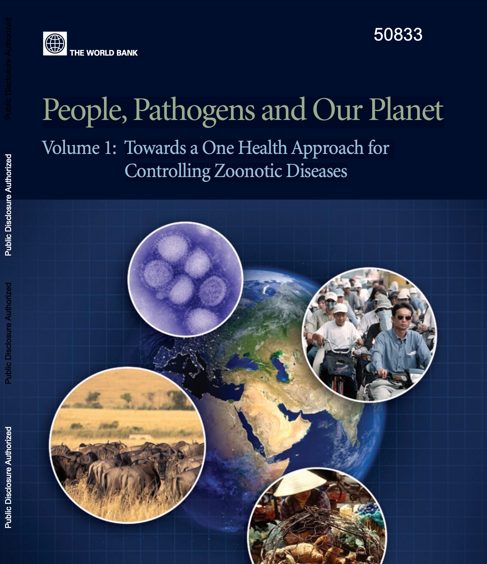
The acknowledgements make clear - prepared by the World Bank, with full cooperation of the WHO, UNICEF, FAO, the OIE, and the DFID.
The foreword quickly outlines the ‘One Health’ mission, and how the implementation at this stage (2010) is not clearly understood.


The executive summary gives a bit more information. We need a global surveillance system to protect us from zoonotic diseases, pandemic or endemic.

If you haven’t already read it, I covered the surveillance system previously.
I also covered the World Bank in regards to implementation of Digital IDs — or as they’re currently known, the EU Vaccination Certificate. Yes, the one which was recently adopted by the WHO.
The World Bank report does a decent job describing the early days of One Health, so I’ll just cut and paste that here.

It also goes in depth with various other surveillance systems, but I won’t cover those here. Fact is that the Georgetown paper is a pretty strong link in this regard - especially as Clare Sullivan - who with Tony Blaire tried to implement National ID cards in 2006 - now works with Georgetown, in the same department in fact as JC Smart who architected the surveillance backend.
On the 17th of November, 2020, a paper was released via the ‘Global Investment Facility’. You can find it here.
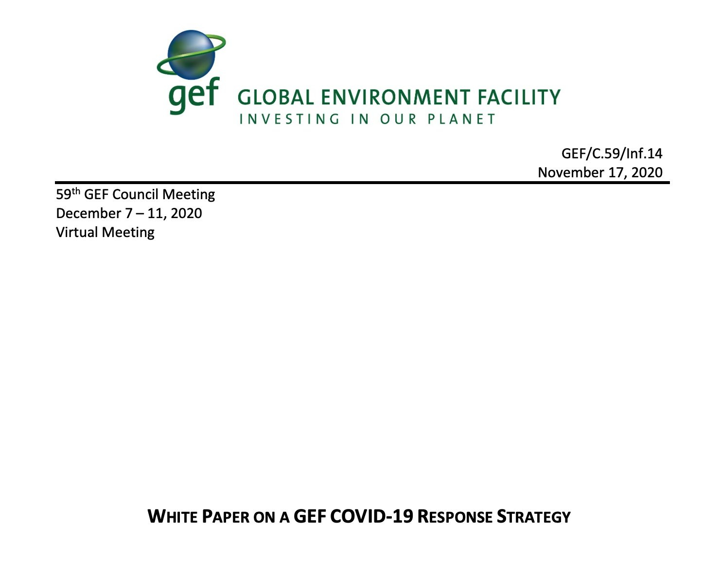
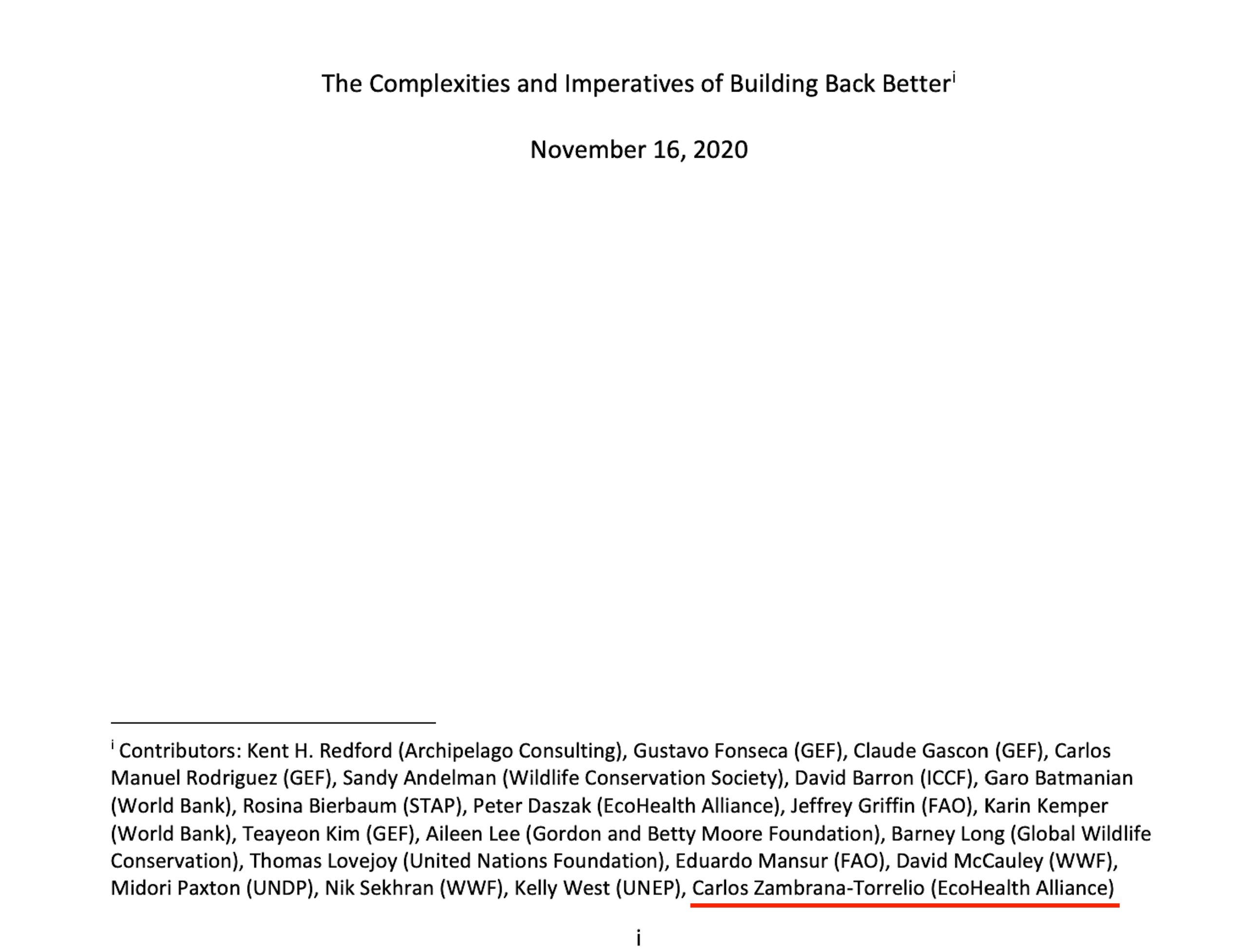
This report is interesting for a number of reasons. First, it was released - buried - at a time where the world was going crazy over covid-19. Consequently, few - if any - picked up on it at the time. A contributor of which was an EcoHealth Alliance employee, but that’s not the interesting part in that regard.
The report specifically names ‘One Health’. And this, in a document titled ‘White Paper on a GEF COVID-19 Response Strategy’. It also refers to the ‘Manhattan Principles’ which were defined in 2004. The World Bank also referred to these, so let’s have a look at what these are about.


Those can be found over here.
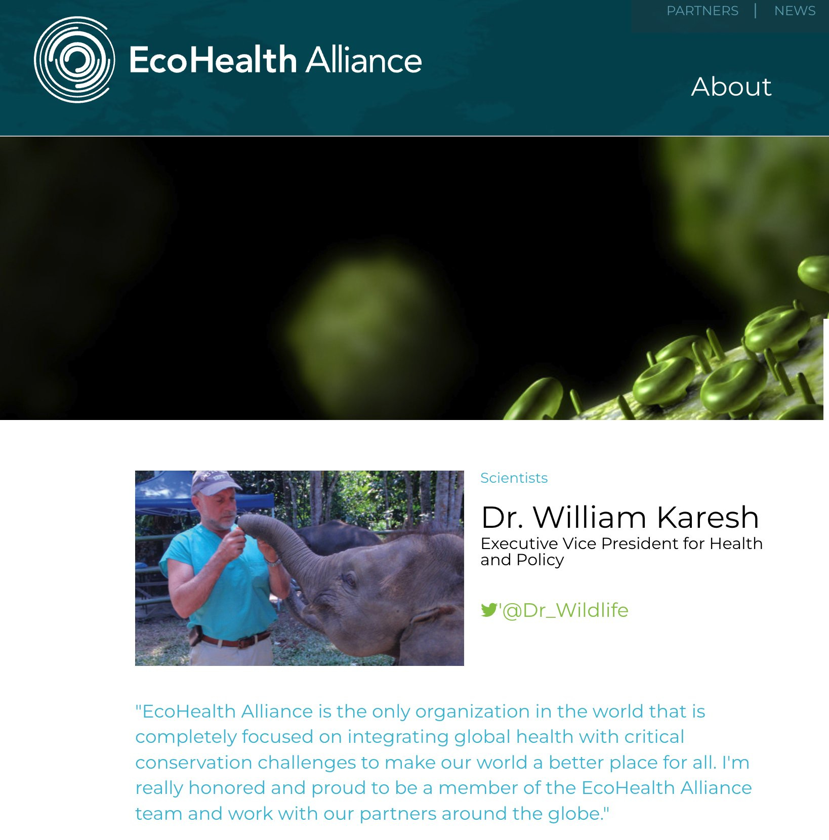
In short, in 2004, at the Rockefeller Centre, the world’s leading global institutions met debating “One World, One Health”. One of the primary co-authors here were William B Karesh… who also works for EcoHealth Alliance. Yeah, that EcoHealth Alliance — they were partners in terms of engineering covid-19.

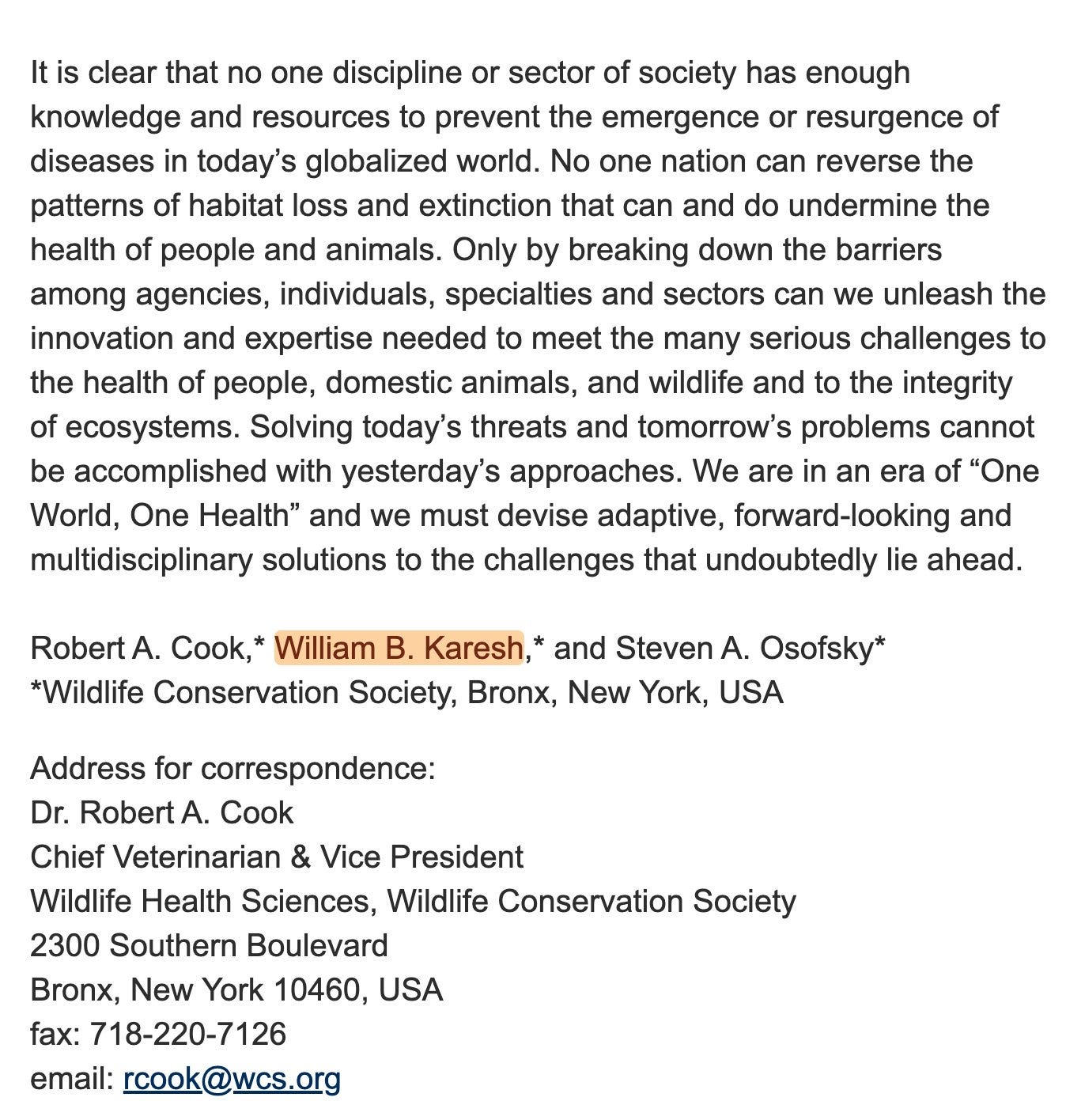
The very first ‘Manhattan Principle’ is this - a request that humans, and animals be considered one and the same.
Which is highly likely why they were adamant that Covid-19 came from bats. They had to sell One Health down the road, after all. In fact, the front page of the World Bank report above outlines this expressly as well — zoonotic.

Principles 3-5 outlines in brief a surveillance apparatus to ‘control and mitigate diseases’. As does principle 9.


And to re-iterate, Georgetown worked on the surveillance technology in the 2010s, while the World Bank worked with the CGD and EU to implement Digital IDs
Principle nine furthermore considers vaccines / pharmaceuticals an area where we should further invest in global health. Principle 4 briefly mentions this as well, ‘human health programs’. Finally, principle 10 outlines the importance of centralisation (WHO), and principle 12 pushes for education on the topic.
To protect us, of course.

In the early years of the 2010s, the United Nations University - yes, they have one, though they claim it’s a think tank - released this strategy plan for the years 2011-14. Their ‘Thematic Clusters’ are in short what they focus on. Items 3 and 4 are those of significance in this regard.
Global health, food/water safety, combating illness. All apply here. Climate change, ecological health, biodiversity, sustainable land. Again, all apply to the ‘Manhattan Principles’.

Ah, but it’s a coincidence. It’s just a coincidence.
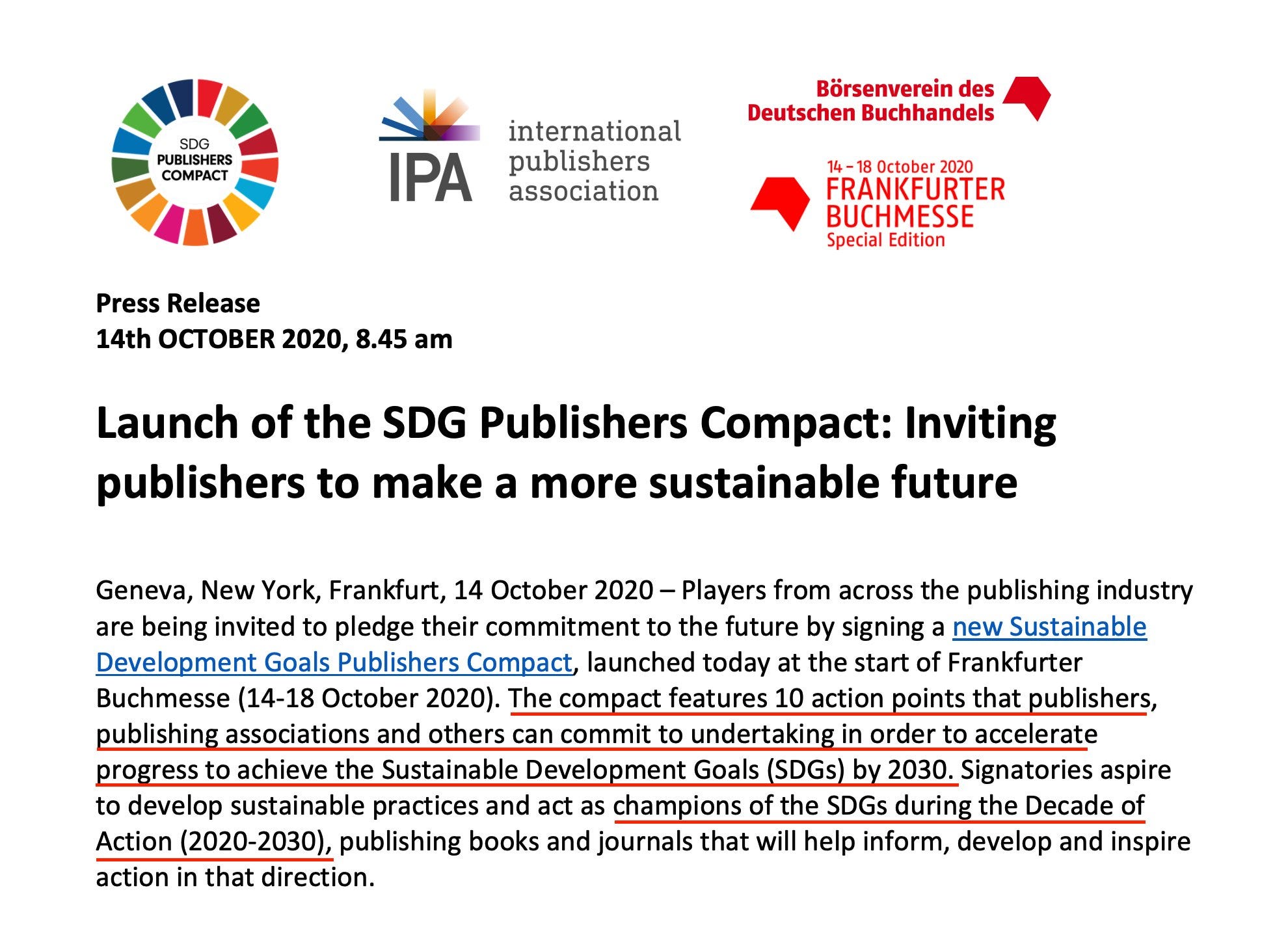
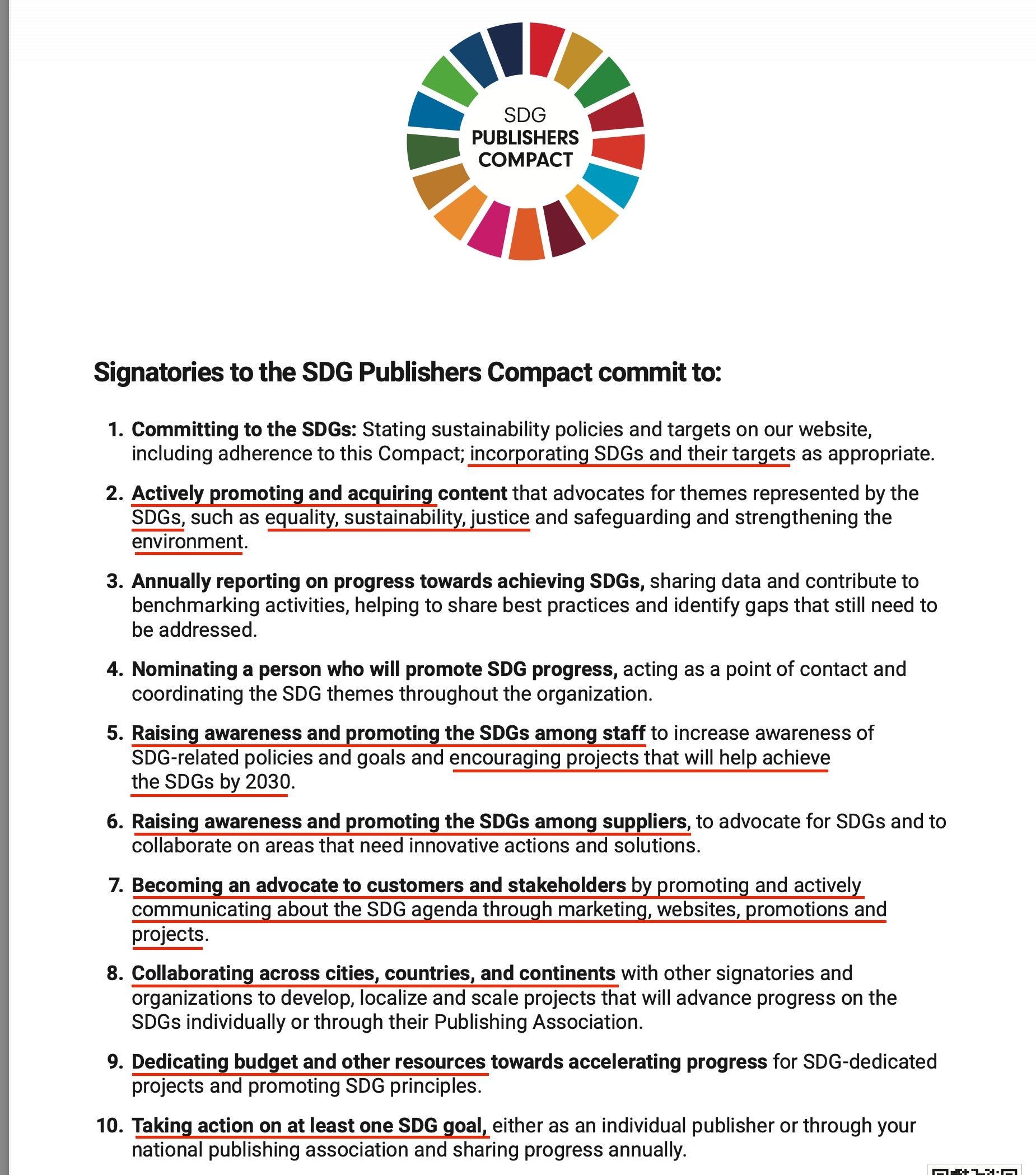
Well, in 2020 the ‘Publishers Compact’ was announced. Sustainable Development Goals, etc. It’s exactly what you expect, they all align on this - they will shove their equality, sustainability, justice in your face at every given opportunity. Does that sound like relevant to the contemporary situation?
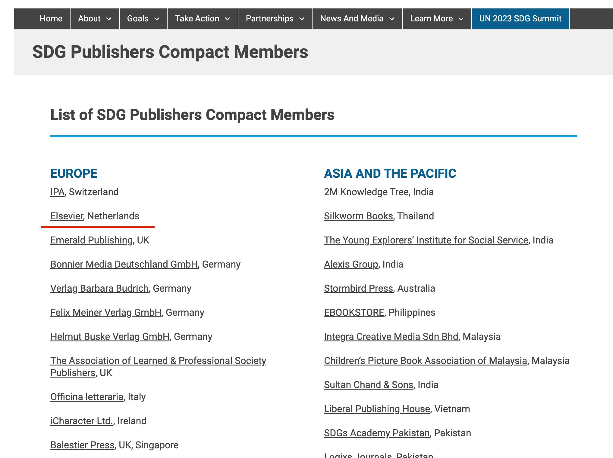
The list of members include a great numbers of large publishing houses. Elsevier, being one. Elsevier, for one, own the Lancet, but they also founded the ‘Climate Change and Health‘ journal - in 2021.
Now, that’s what we went through yesterday, in the article on Vanessa Kerry. The WHO only days ago hired her in exactly this capacity - a conflation of climate and health.
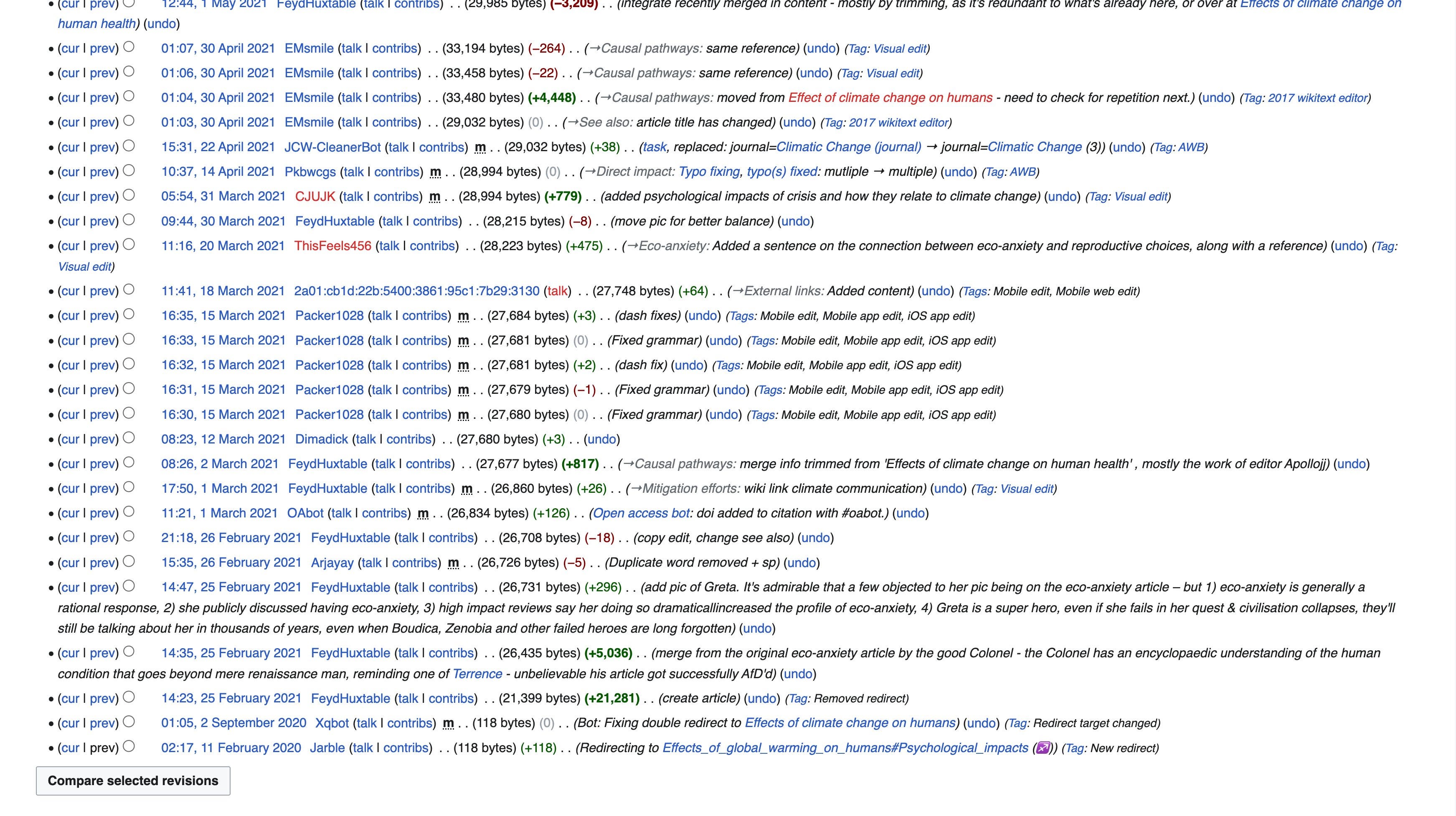
And, in this regard, I will say they are very well organised. Up until this journal came to be, Wikipedia didn’t have any information on this blatant conflation whatsoever.
And then, on February the 25th, 2021, it suddenly got its own article. A new science had been invented.
There’s more in this area, but where these ludicrous pseudoscientific claims are present, Heidi Larson is usually not far off - covered here.
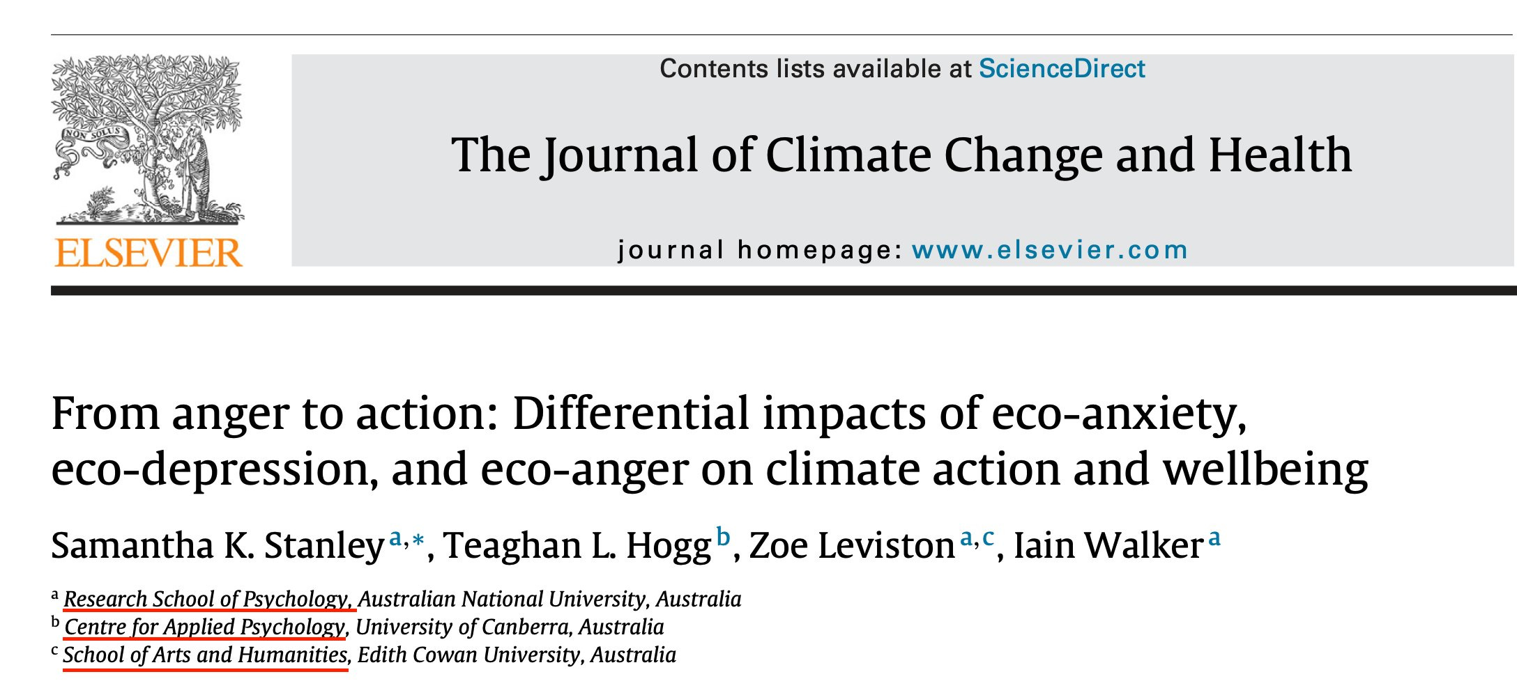
In the very first edition, the ‘The Journal of Climate Change and Health‘ carried this article. ‘From anger to action’. Make no mistake - this is a manipulative call for action. They want you on the streets, demanding policies enacted to control ‘climate change’. They even discuss which types of emotions are the most exploitative.
This article is a straight up call for activism.
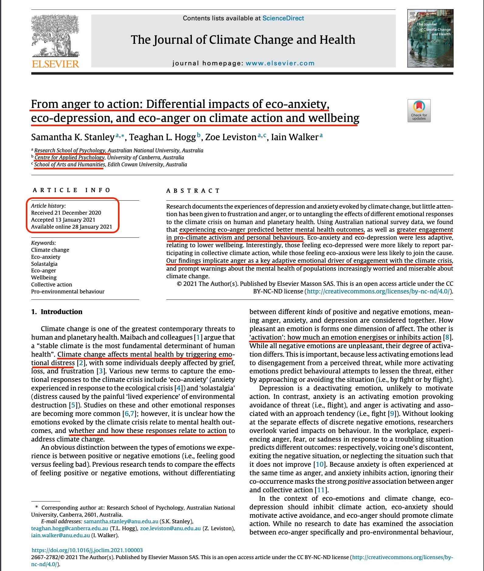

And in that regard, let’s just have a look at the authors. All ‘soft’ scientists. This is about manipulation, the sort of thing in which SAGE engaged during Covid-19.
I also find it interesting that the paper was received 21 December 2020, which means it must have been worked on during earlier stages of the Covid-19 scamdemic.
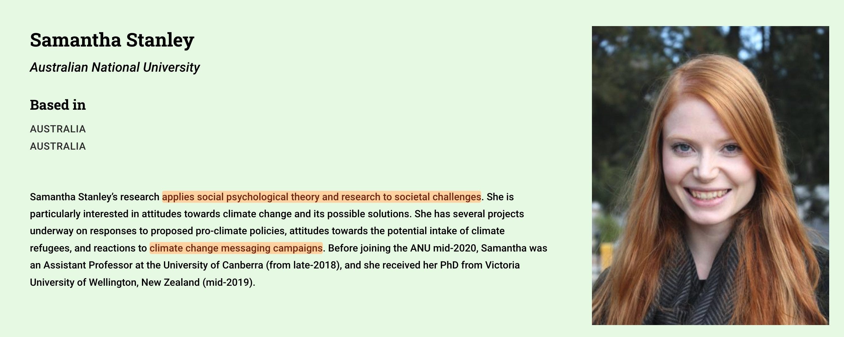
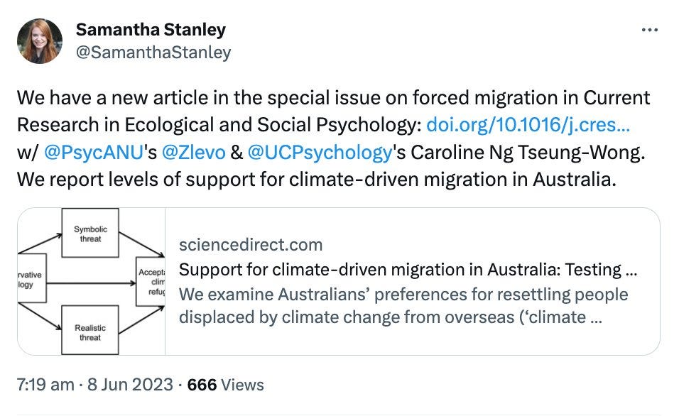
Let’s have a look at the authors. Primary one is Samantha Stanley. She’s a ‘nudge unit’ type employee, working for the ‘Climate Social Science Network’.
She’s got a Twitter account. Here’s a Tweet of hers. This is a UN speciality topic - migration. You can be damn certain she will be pro migration, because they all are. They use migration to force change, as per a now-gone WEF article on the web.
666 views appears appropriate.
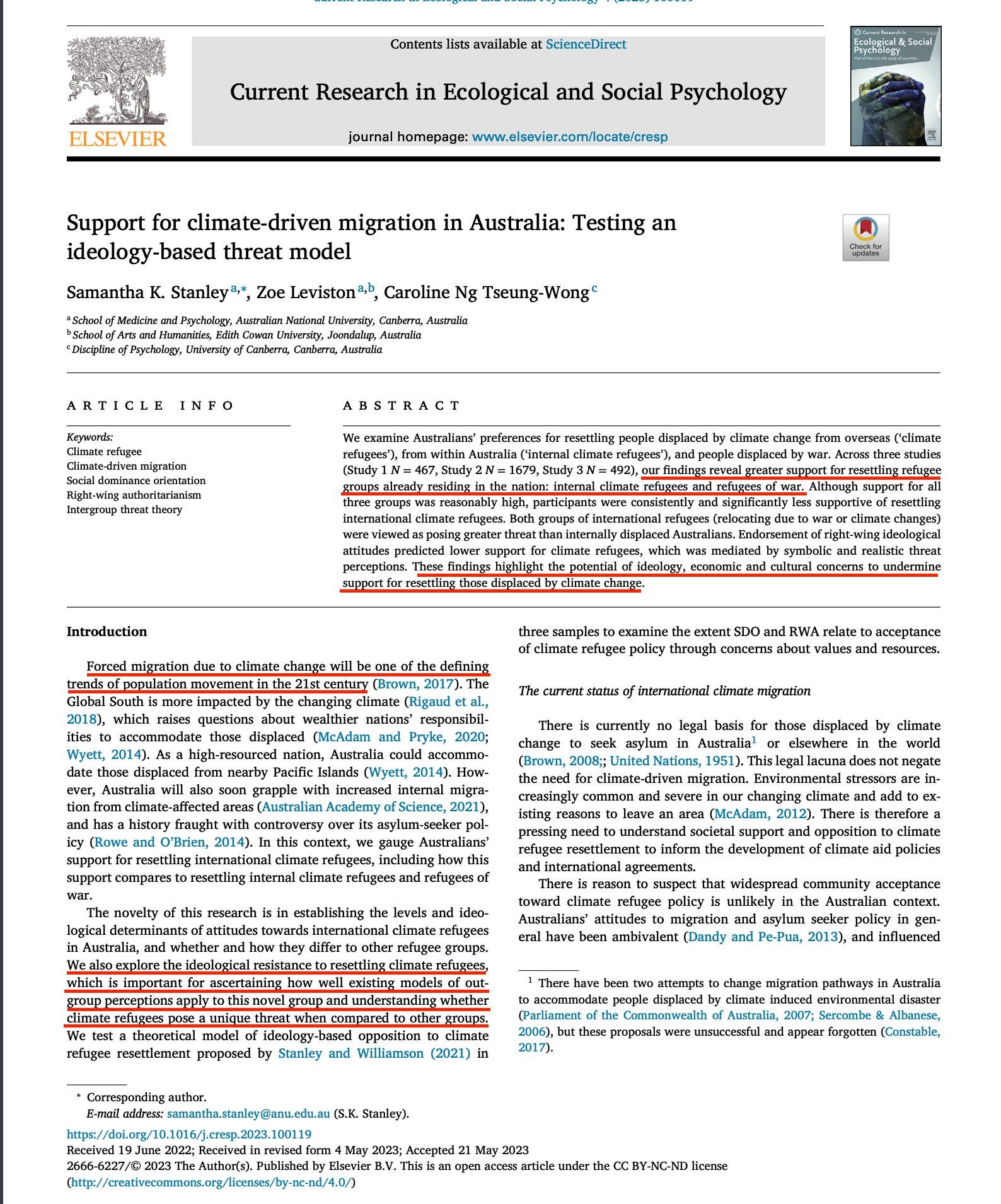
The paper can be found here. ‘Support for climate-driven migration in Australia: Testing an ideology-based threat model‘. The article is entirely about manipulating people into accepting migration. Yes, these literal Marxists think those people whose forefathers built the nation are just tools to be manipulated.
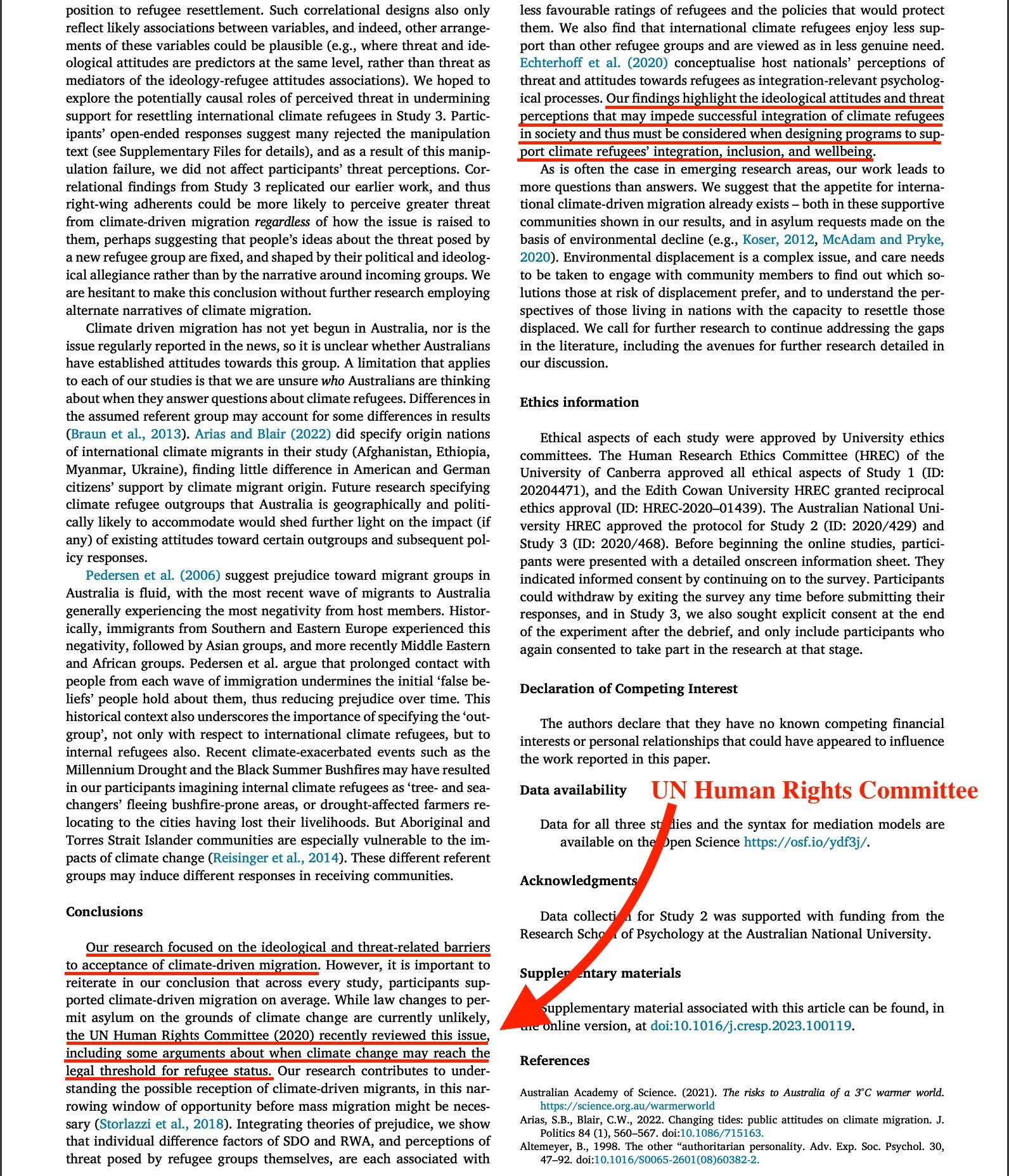
And naturally, the UN Human Rights Committee are onboard. All they ever do is recommend more migration.
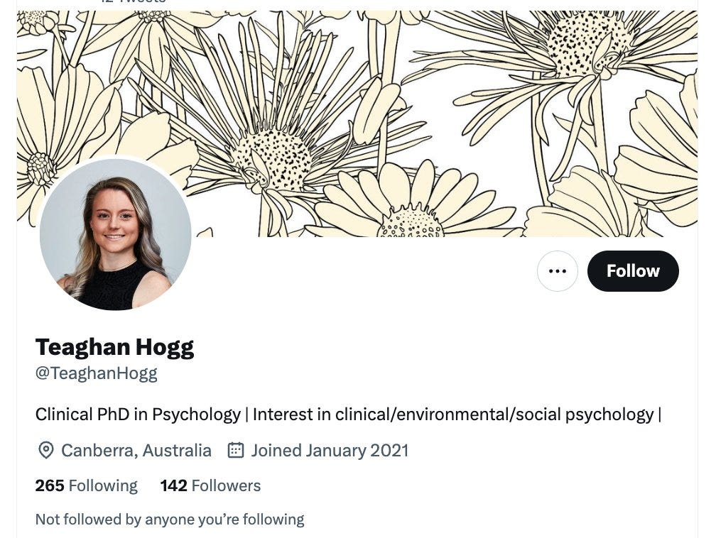
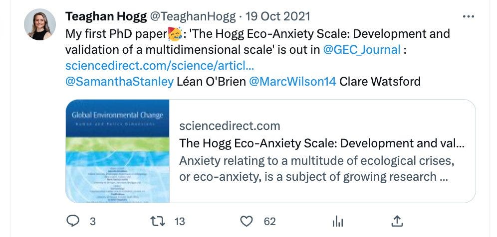
The next co-author and fellow Marxist is Teaghan Hogg. Another young idiot, with no life experience, who’s got the audacity to think her fellow citizens are mere tools to be manipulated.
She only created a Twitter account in Jan 2021 - same time she co-authored the paper. She recently released a PhD paper, probably her thesis, but it’s not available for free and I'm for sure not paying for Marxist trash. Besides, there's a far more interesting tweet on her timeline.
Well, see another manipulative piece of trash wrote a research article on how to - in absolutely authoritarian fashion, because these a-holes could not care less about you, and nor do they have any historical perspective whatsoever.
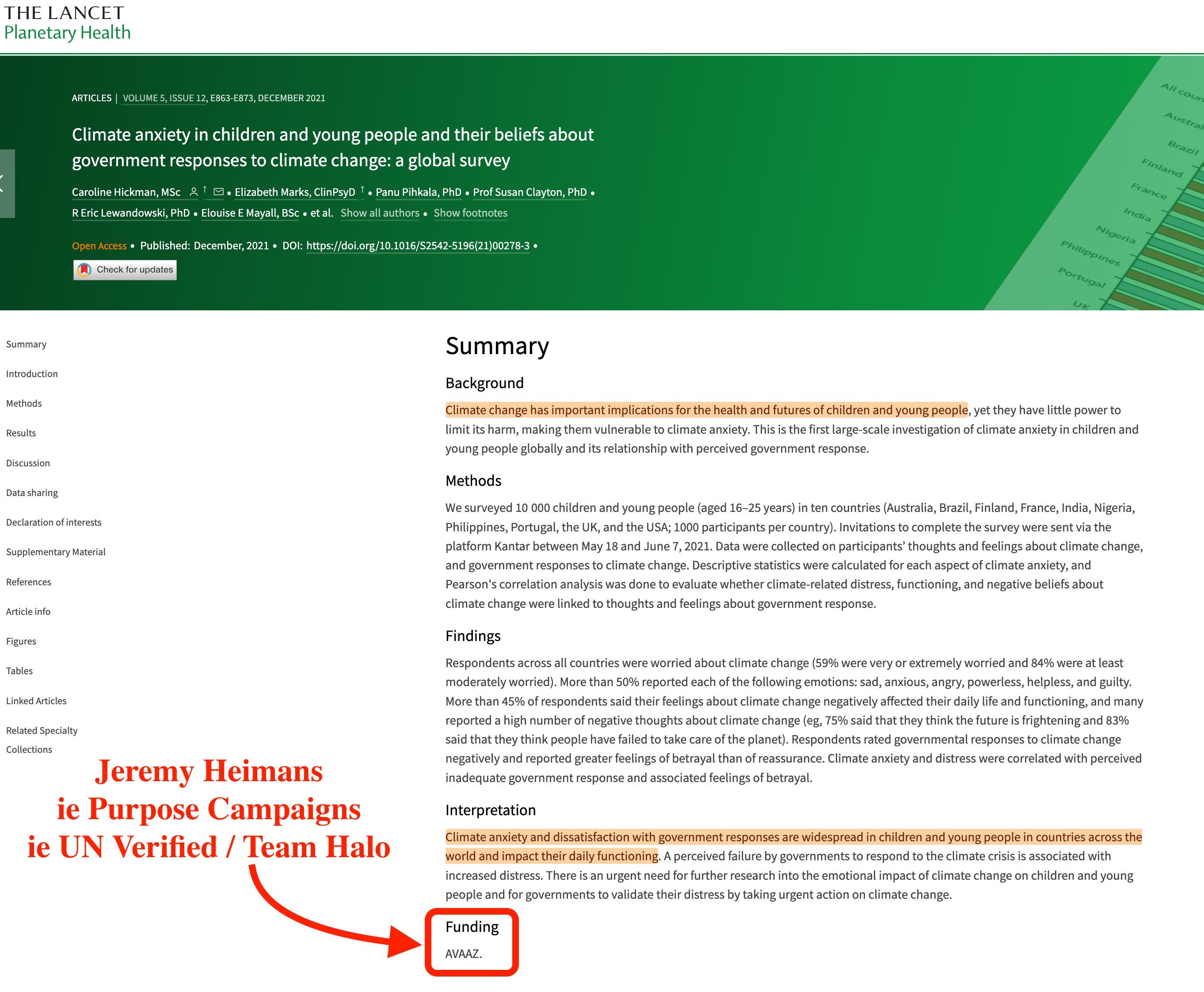
Children, youth, climate anxiety. They are literally fabricating the next vector of exploitation for the mainstream media. And where was it printed, you reckon?
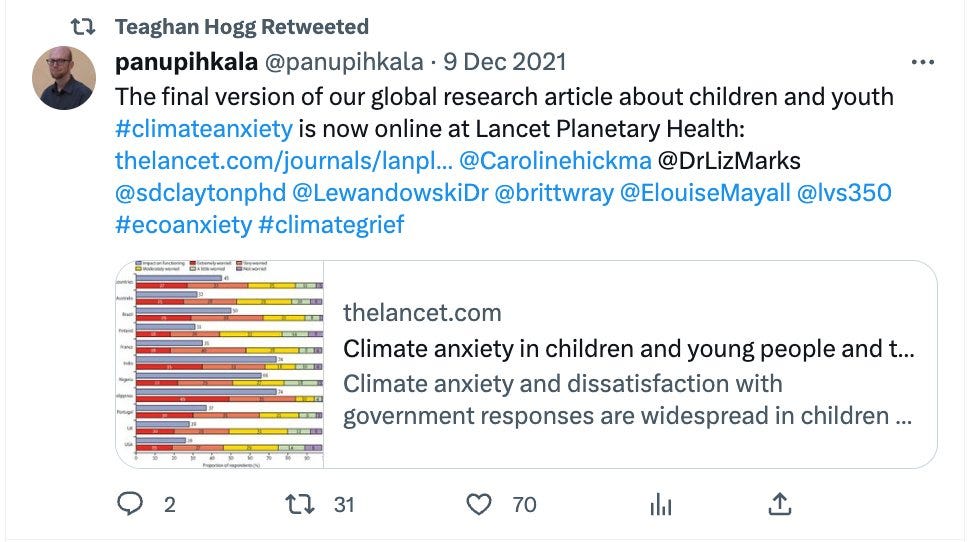
Here, in Elsevier’s flagship publication The Lancet.
Funded by - AVAAZ - ie, Jeremy Heimans’ enterprise. The guy who also co-founded Purpose Campaigns (which I will get to later), aka UN Verified / Team Halo.
Yes, funding came via the absolute piece of trash who employed people to lie on the internet about the safety of Covid-19 vaccines.
Jeremy Heimans furthermore has a number of interesting connections. Besides being in cahoots with Gates (of course), he’s also a WEF Young Global Leader.
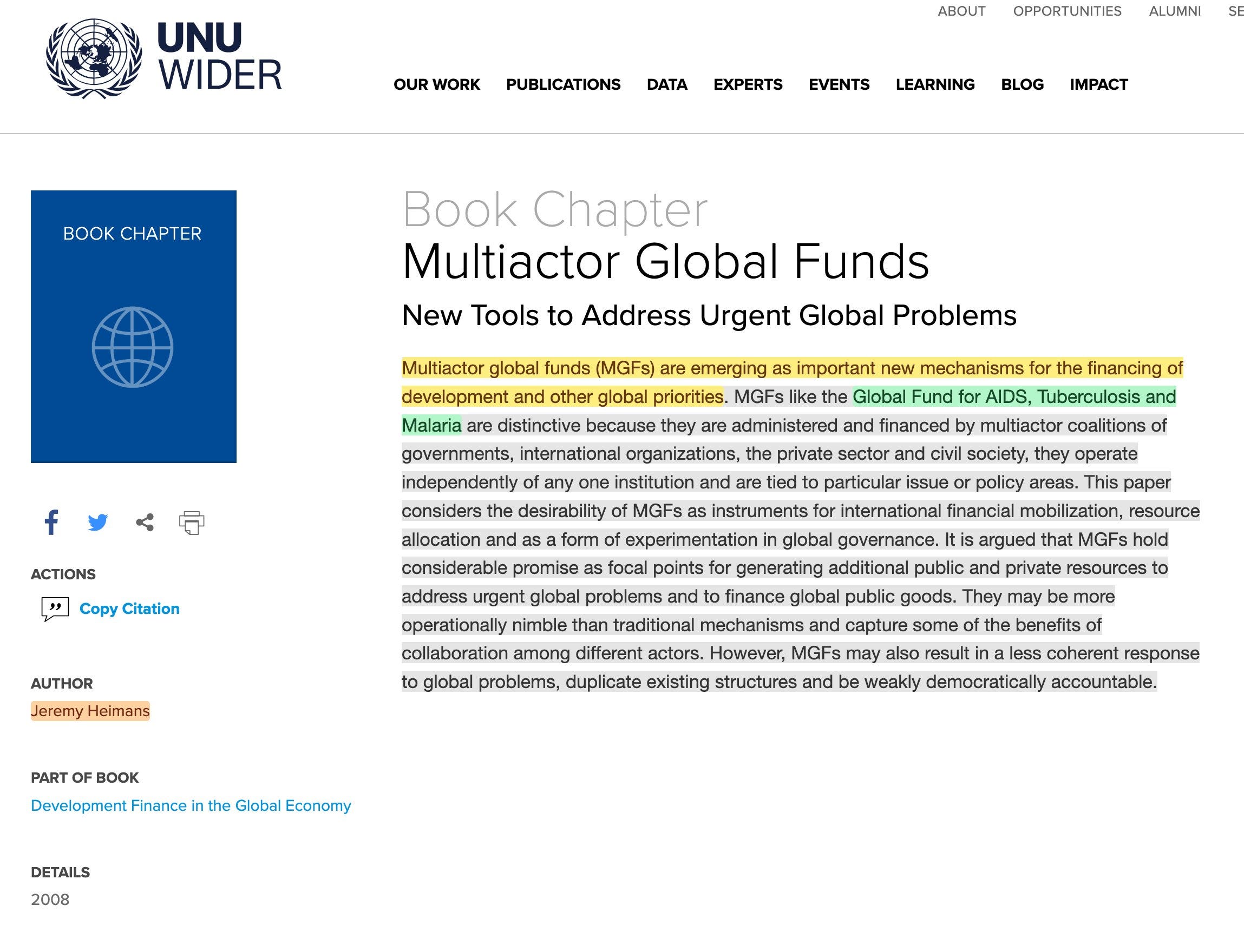
And furthermore - he contributed to a book on multi-actor global funds.
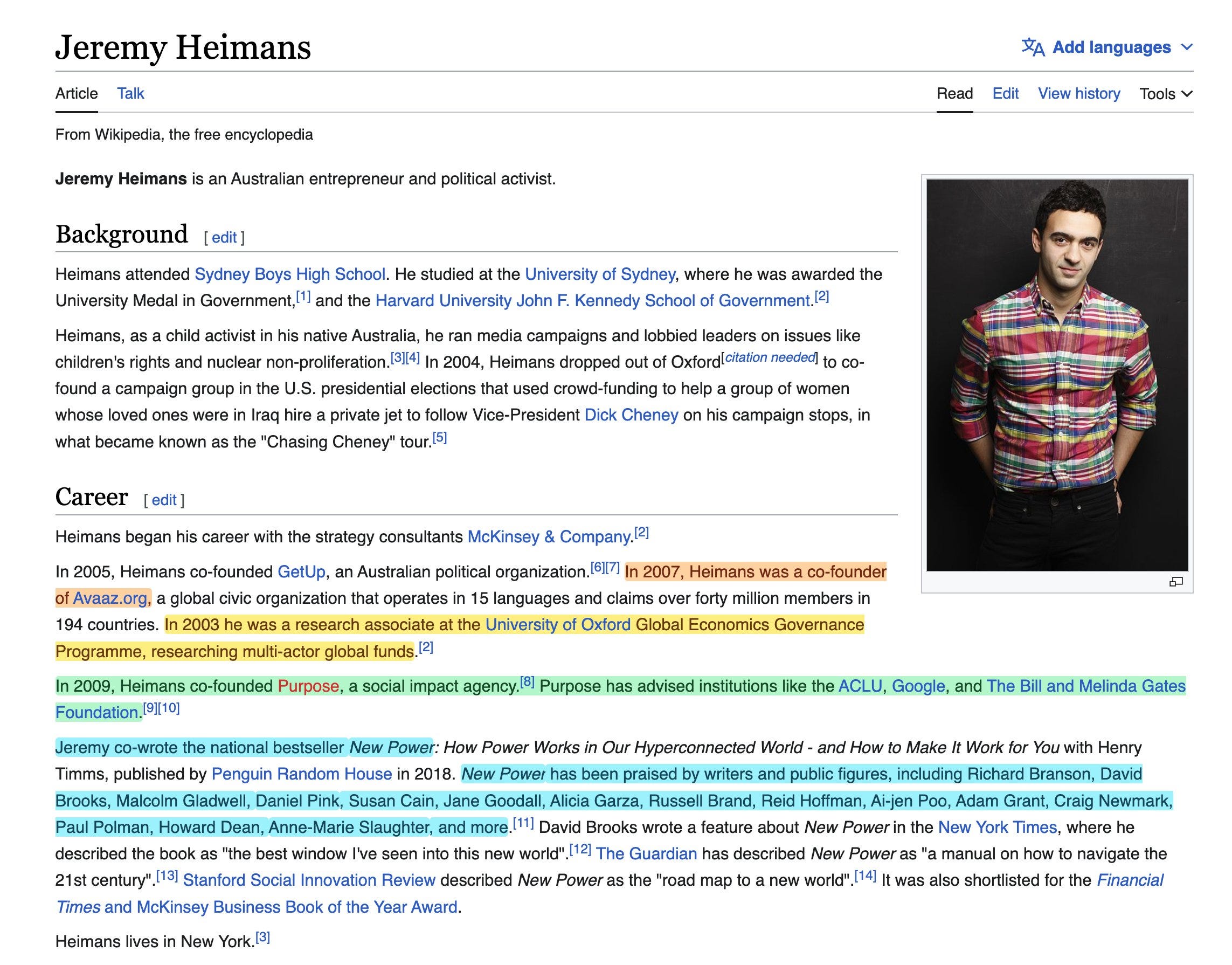

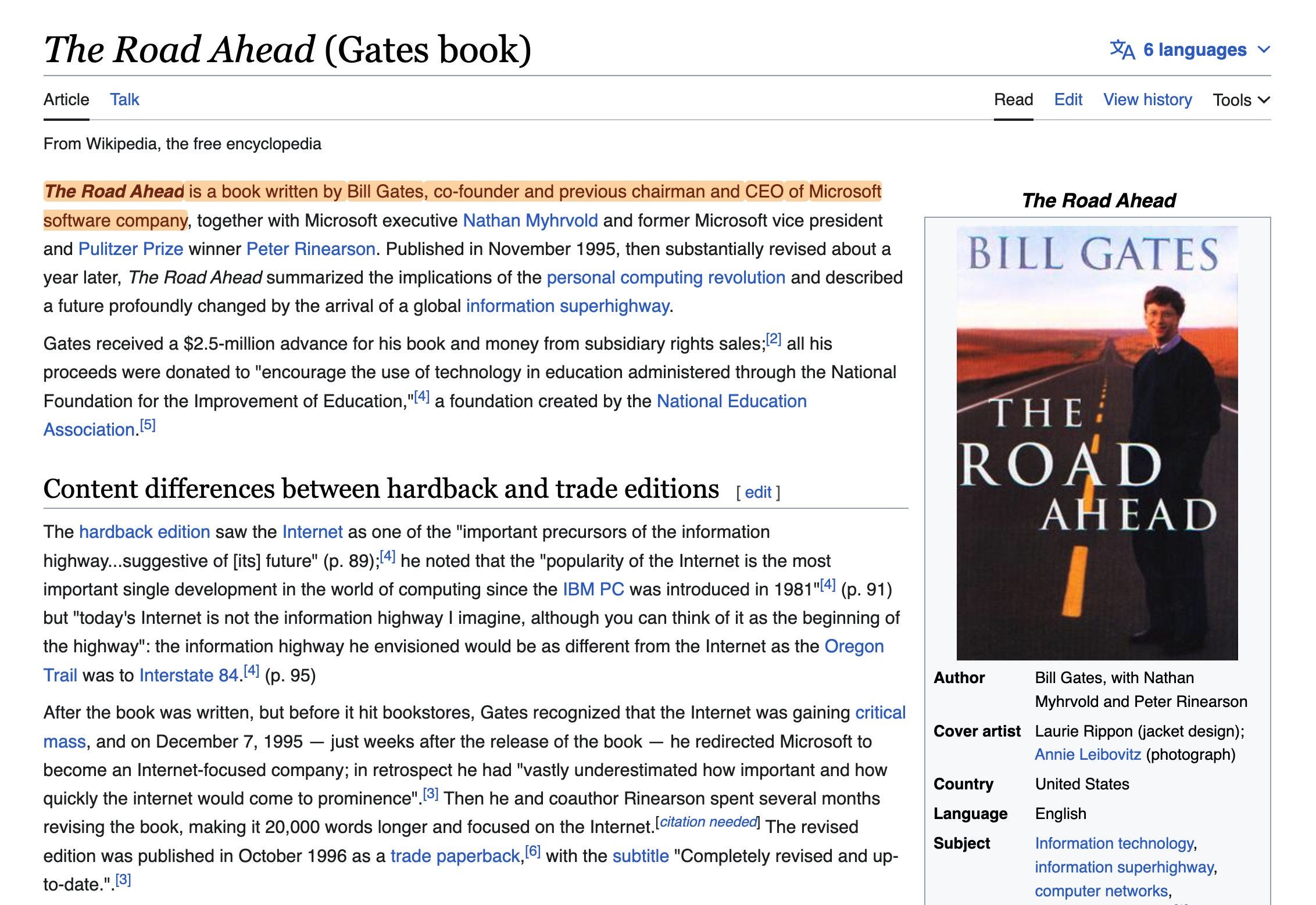
The book was in released in 2008 and was named ‘Development Finance in the Global Economy: The Road Ahead‘. Here’s the chapter he wrote. Oh wait, UNU Wider? There’s that United Nations University ‘which is not a university’.
And, in this regard, let’s try to set aside that the title of the book also appears to have rather a lot in common with this book. But that’s not the only coincidence here.
The chapter which he wrote contains a few interesting tidbits.
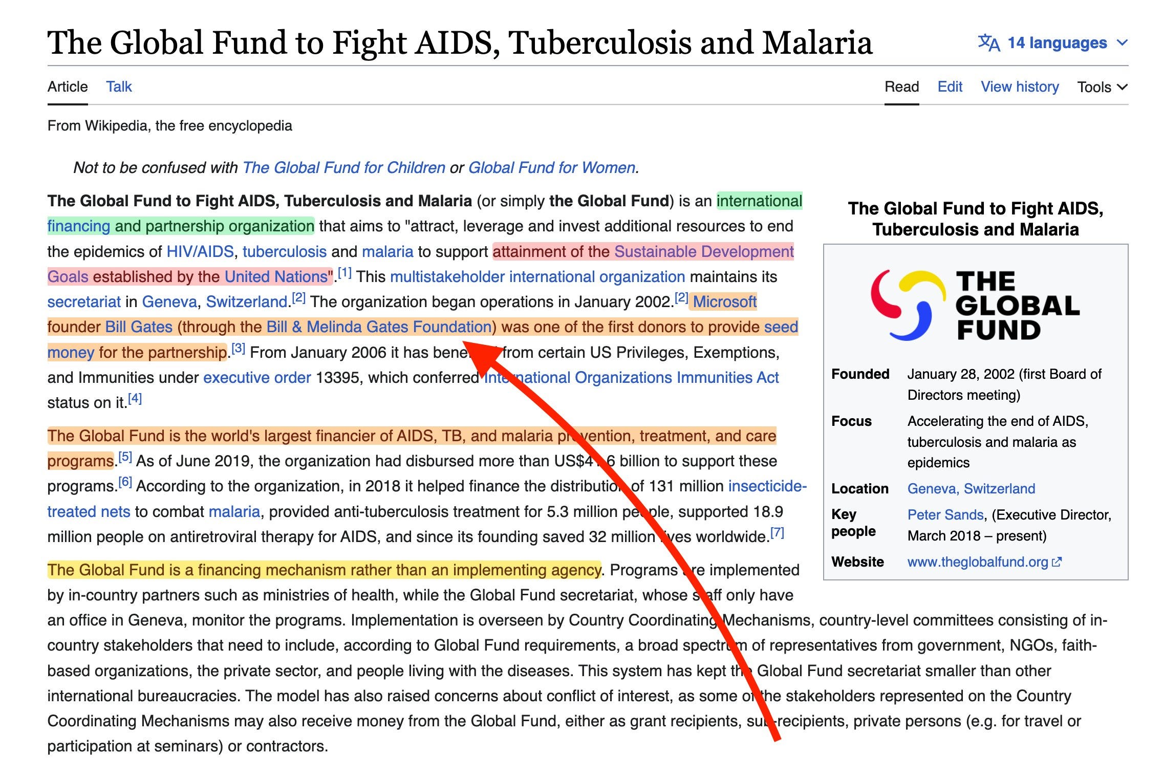
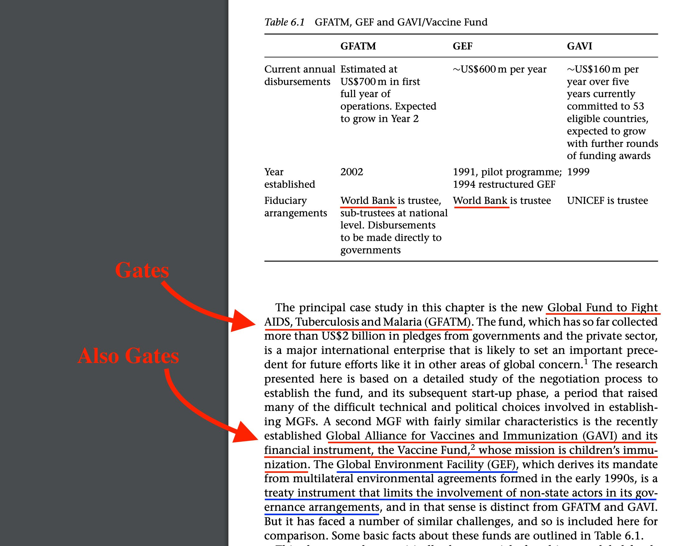
Oh look, he lists three examples. ‘The Global Fund to Fight AIDS’ (which is listed above, and funded by Gates), GAVI (which is sponsored by Gates), and the GEF.
The Global Environment Facility - who penned the report above, the ‘White Paper on a GEF COVID-19 Response Strategy’.
The book also reveals why GAVI were as successful as the case was, and why Gates funded it as well as he did.
It’s simple really. The strategy of, ie, the NHS paying doctors to ‘vaccinate’ versus Covid-19 was lifted straight from GAVI. $10 per recipient up front, and $10 when targets were met.
It’s bribery.

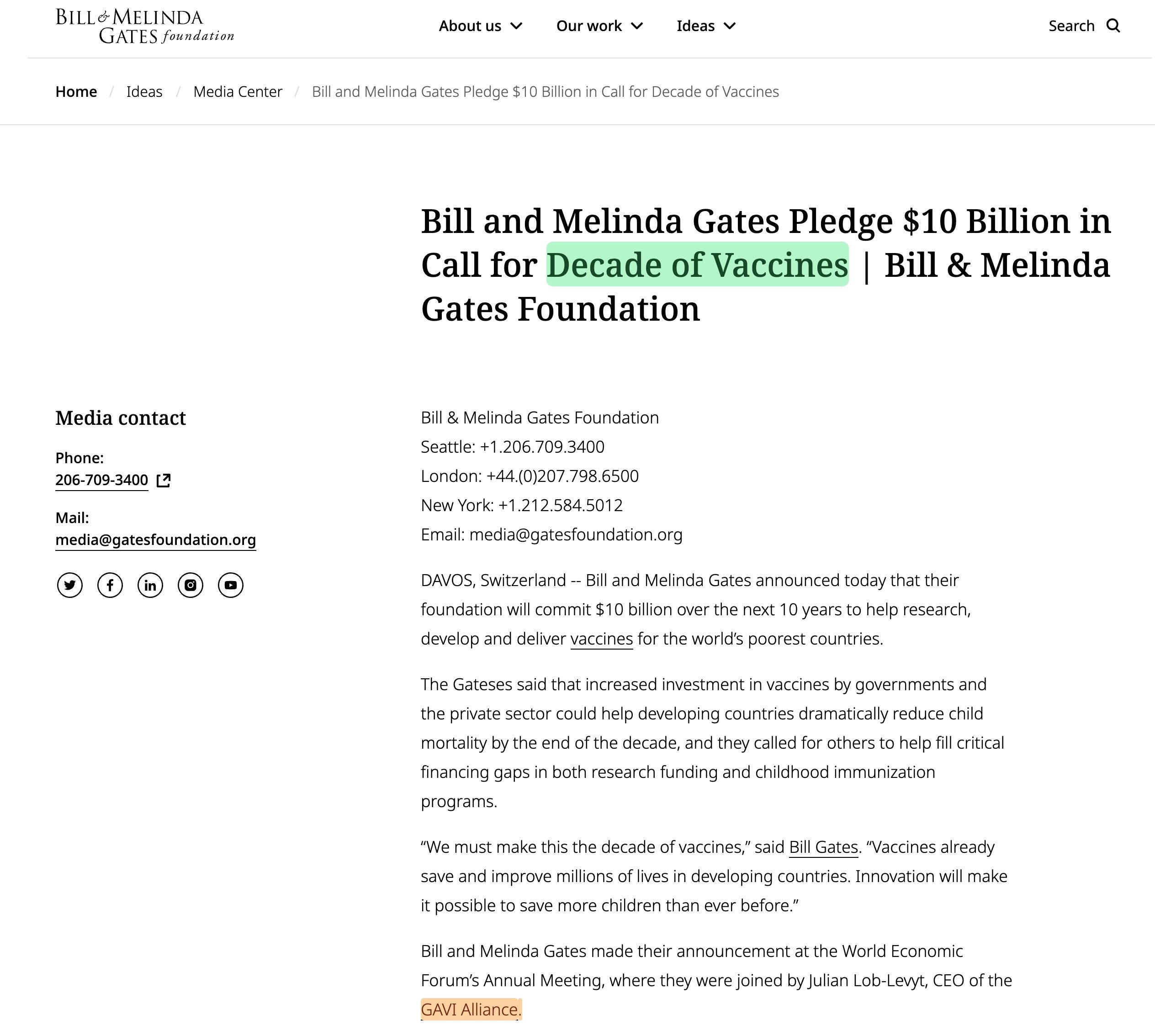
As for funding - the Gates Foundation spent $10bn funding GAVI during the ‘Decade of Vaccines’.
Which was 2010-2019, immediately after the release of the book (2008).
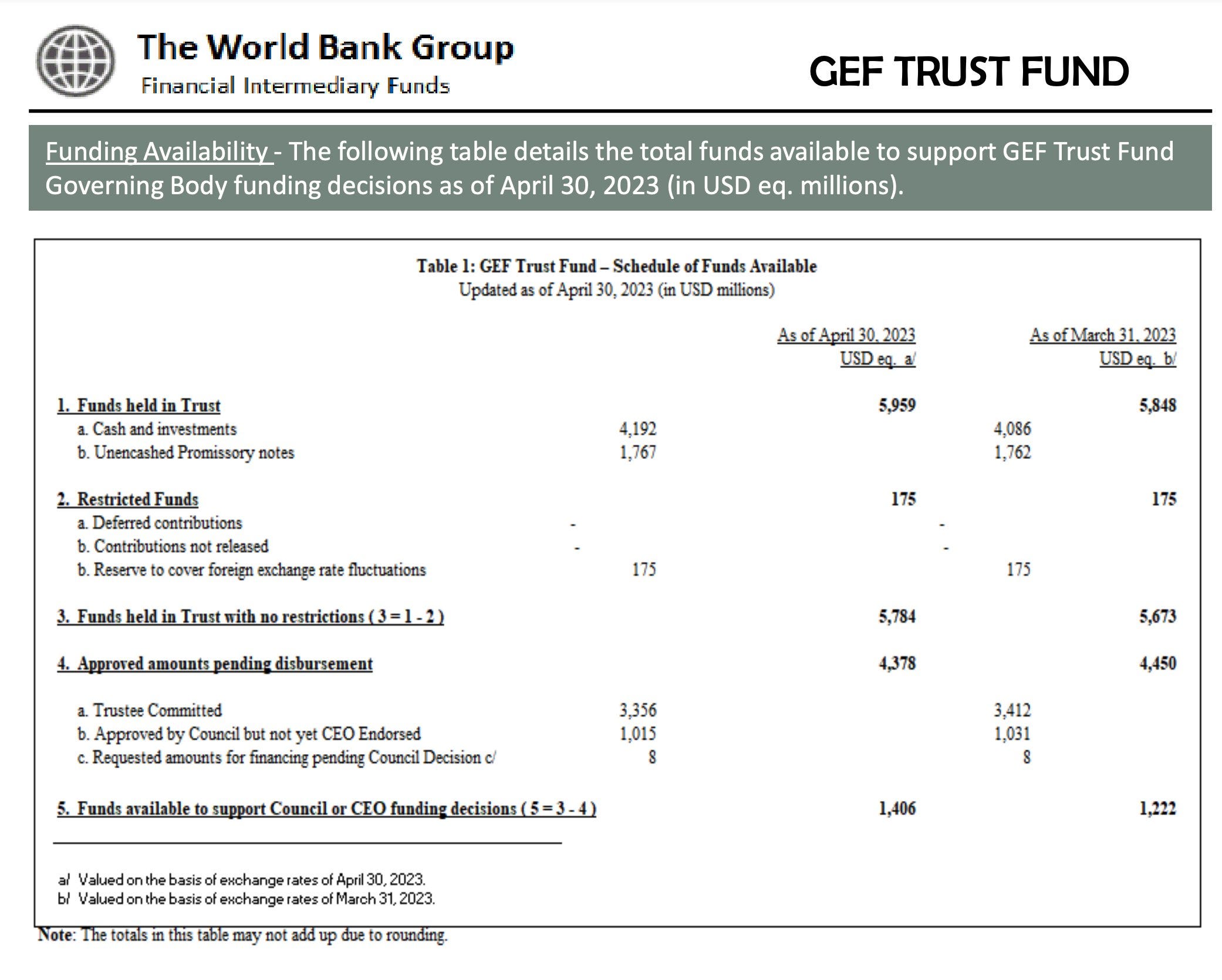
As for the GEF, their trustee is none other than the World Bank. Legitimately ridiculous. How many other organisations do they act as trustee for?
Anyway, I accept this link is weaker than it should be. So let’s continue. Because we are not done. We are really not done.
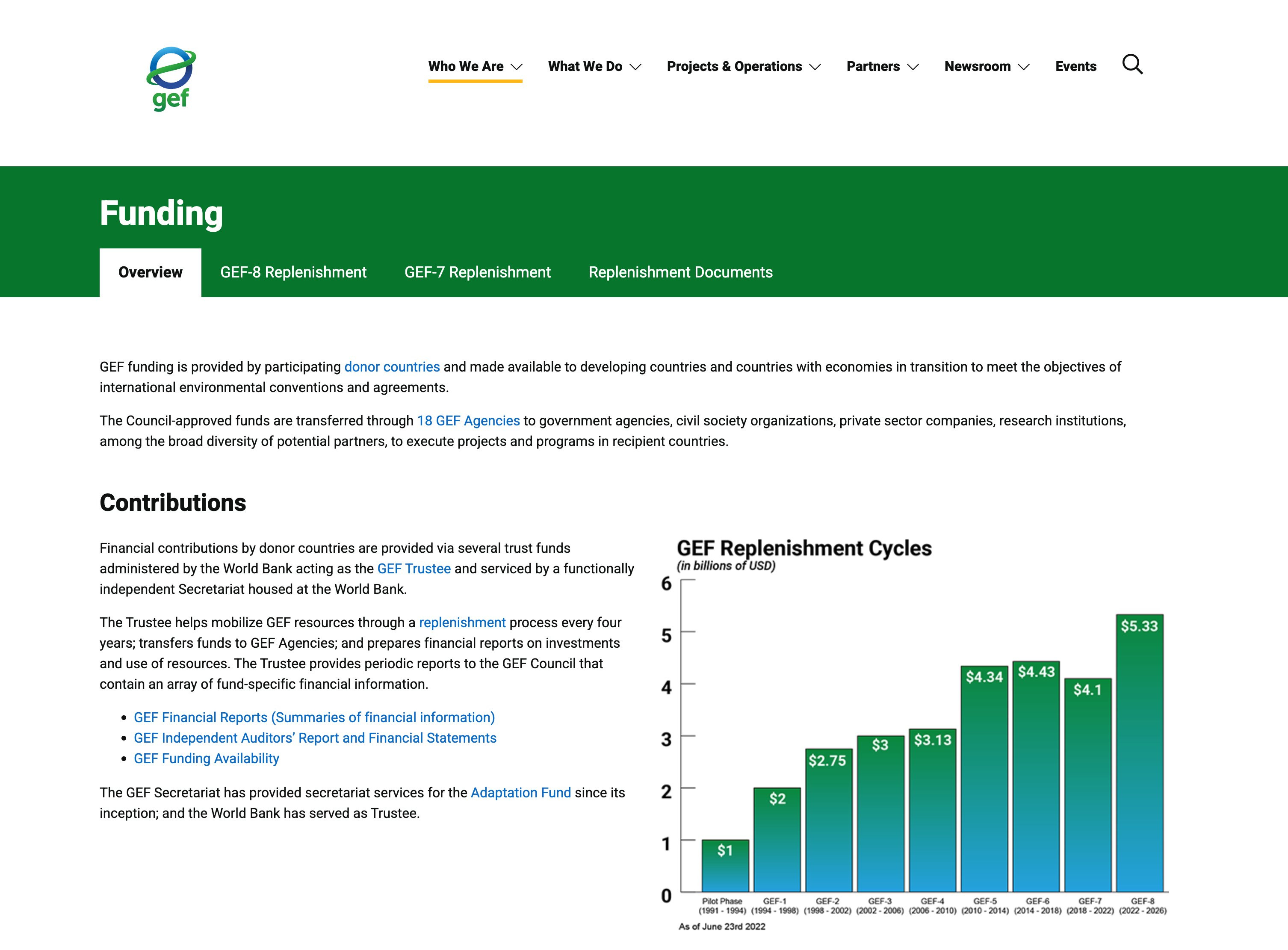
The GEF website can be found here. Funding now standing at $5.5bn.
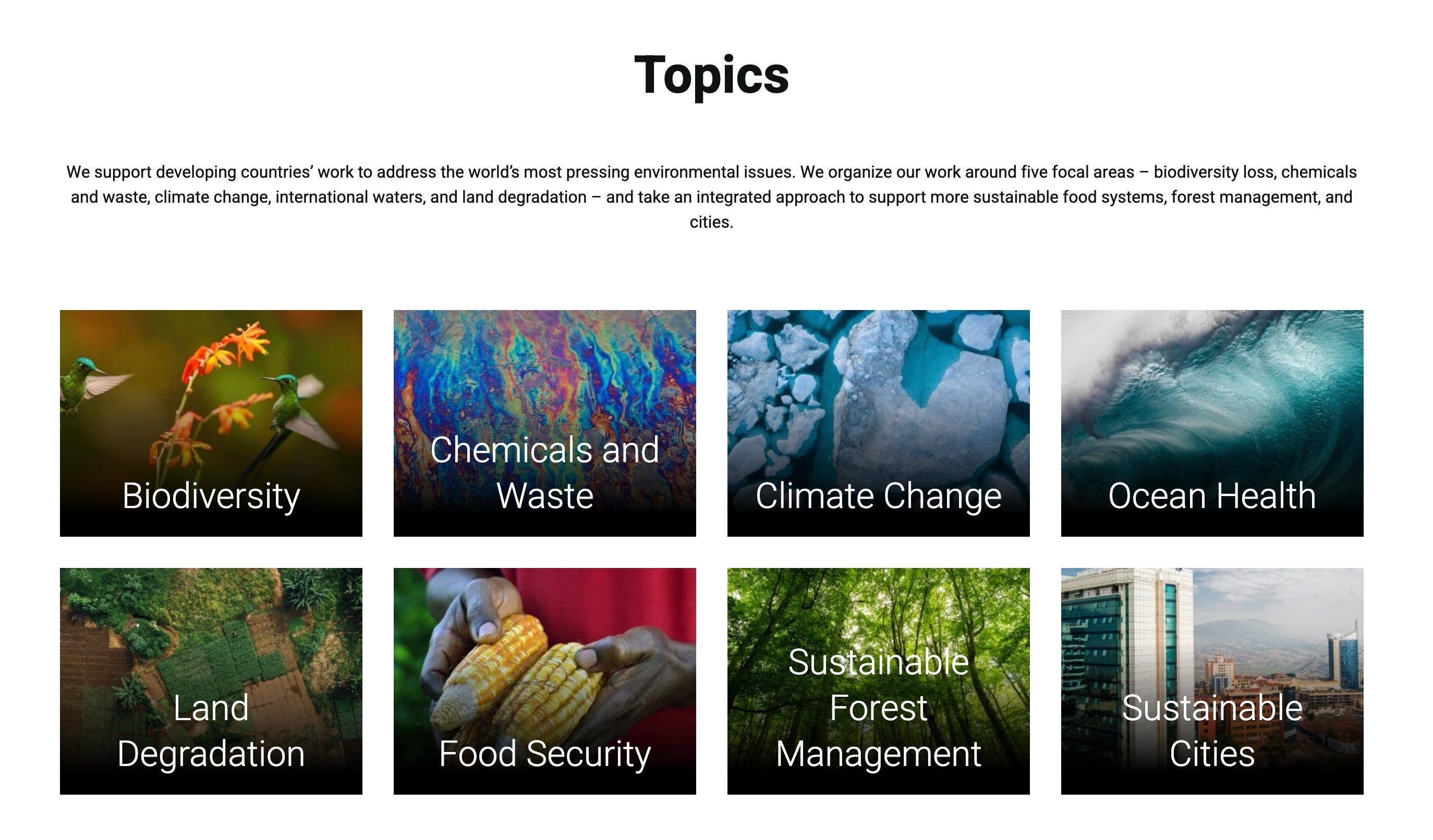
Their topics? Save the species, fix pollution, fix the climate, fix the oceans, fix the land, fix the forests, and... sustainable cities.
And in this regard, let’s just set aside that up until then, all their stated topics line up squarely with the Sustainable Development Goals, AND the Manhattan Principles.
The page on sustainable cities can be found here. Their program can be located on the right, ‘Sustainable Cities Program’.

The program is fairly bland. The ones means for mainstream consumption always are, because you wouldn't agree with it, if you knew what was in it. But there's an interesting reference on the page. Spot it?
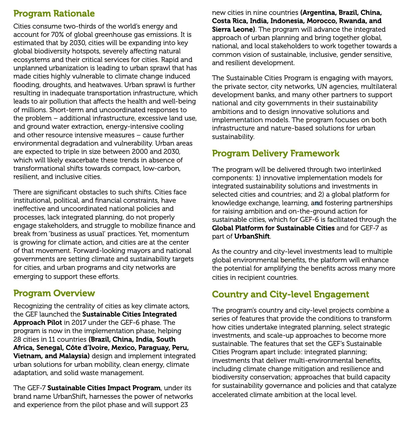
The reference of which I speak is this one ‘Global Platform for Sustainable Cities‘.
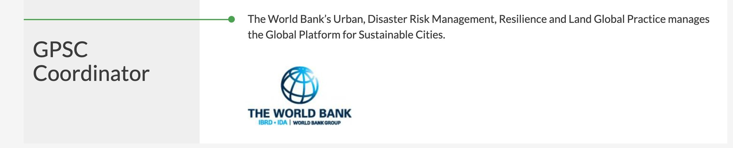
Setting aside for a minute that the primary email address (bottom left) is one that directs you to the World Bank, there’s a different partner which stands out. In fact there are more, but one in particular here.
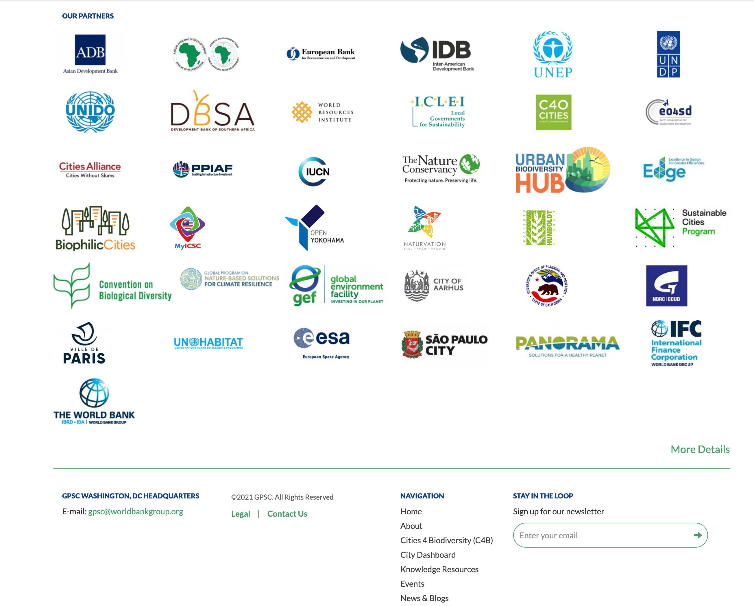
World Bank is claimed to be the coordinator, but for fucks sake. The World Bank acting as the trustee for the GEF, and now, as the coordinator for the ‘Global Platform for Sustainable Cities’? Give me a break.
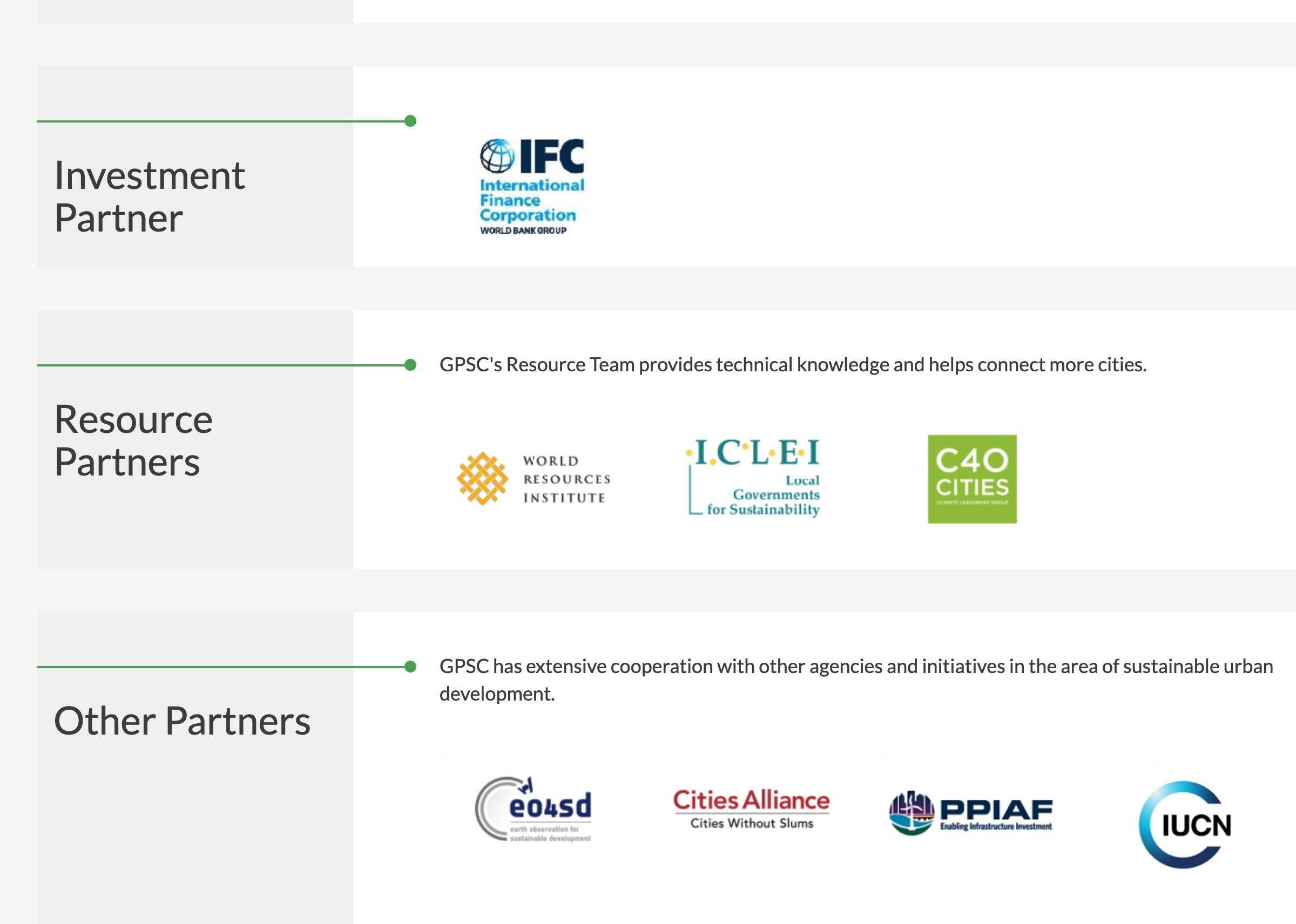
The ‘Resource Partners’ lists C40 Cities. Their website looks like shit, but that’s not important.
Because just one click further, and you land on this page. Partnered with the largest ‘value-add fund’ — 15 MINUTE CITIES.

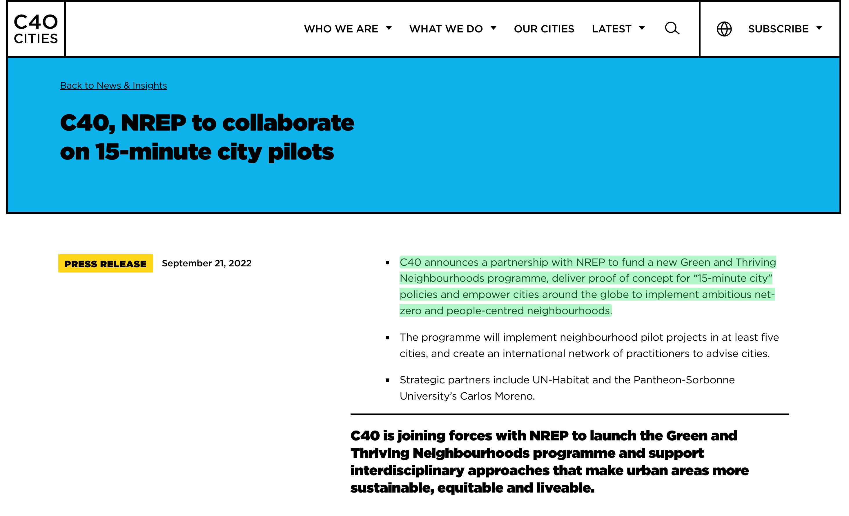
Go a bit further down the press release dated September 21, 2022, and you find this

Explicitly about Net Zero - let there be no doubt about it. And strategically partnered with UN-Habitat. The present chair of C40, for the record, is Sadiq Khan who is currently making life a living hell for car-owners in London, and who has pledged to make London carbon neutral - by 2030.


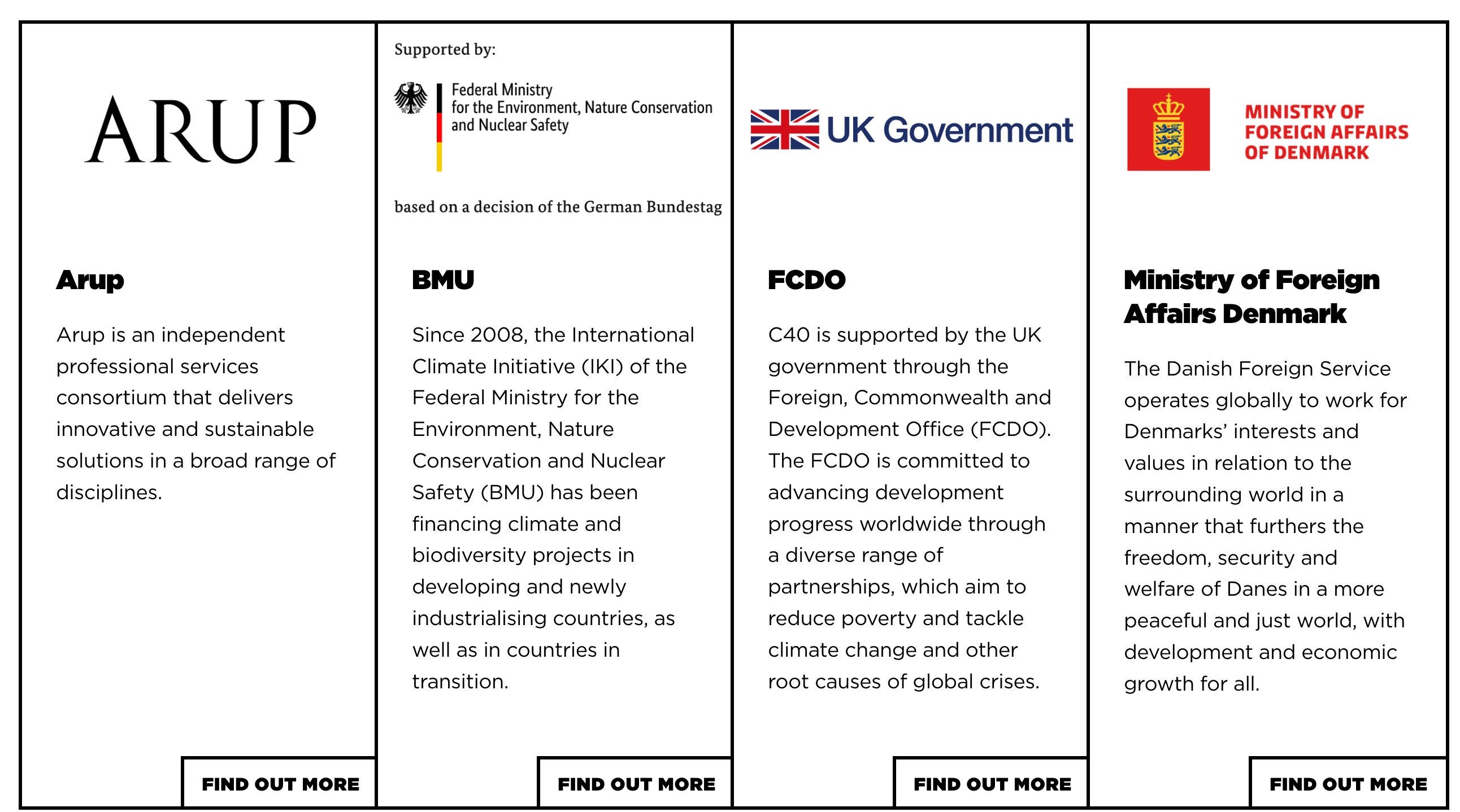
And who funds this trash? Germany, the UK, and Denmark for starters.
But let’s zip right back to the start. Because let’s make one thing certain - the world’s billionaires, who zip around the world in their lear jets - do not have any grounds to preach to the proles about ‘health equity’. That is an absolute joke. Yet, they do.
But, of course, a different way to say “Health Equity” is by saying “One Health”.
Global communism, but this time the proles are equal to all the other animals.


And coming back to their organisational capacity, they are very impressive. Because at the start of 2020, a flood of papers trying to muddle the waters between humans and health were released.
This also perfectly explains why they were so insistent upon covid-19 being zoonotic. Because that integrates fully into 'One Health'. And thank you to our sponsors.
Of course, William Karesh works for the EcoHealth alliance, and he co-authored the Manhattan Principles. And EcoHealth Alliance were primary to the lab fabrication of Covid-19.
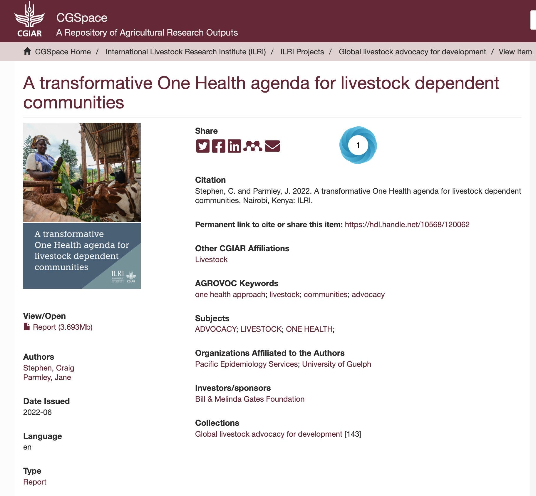
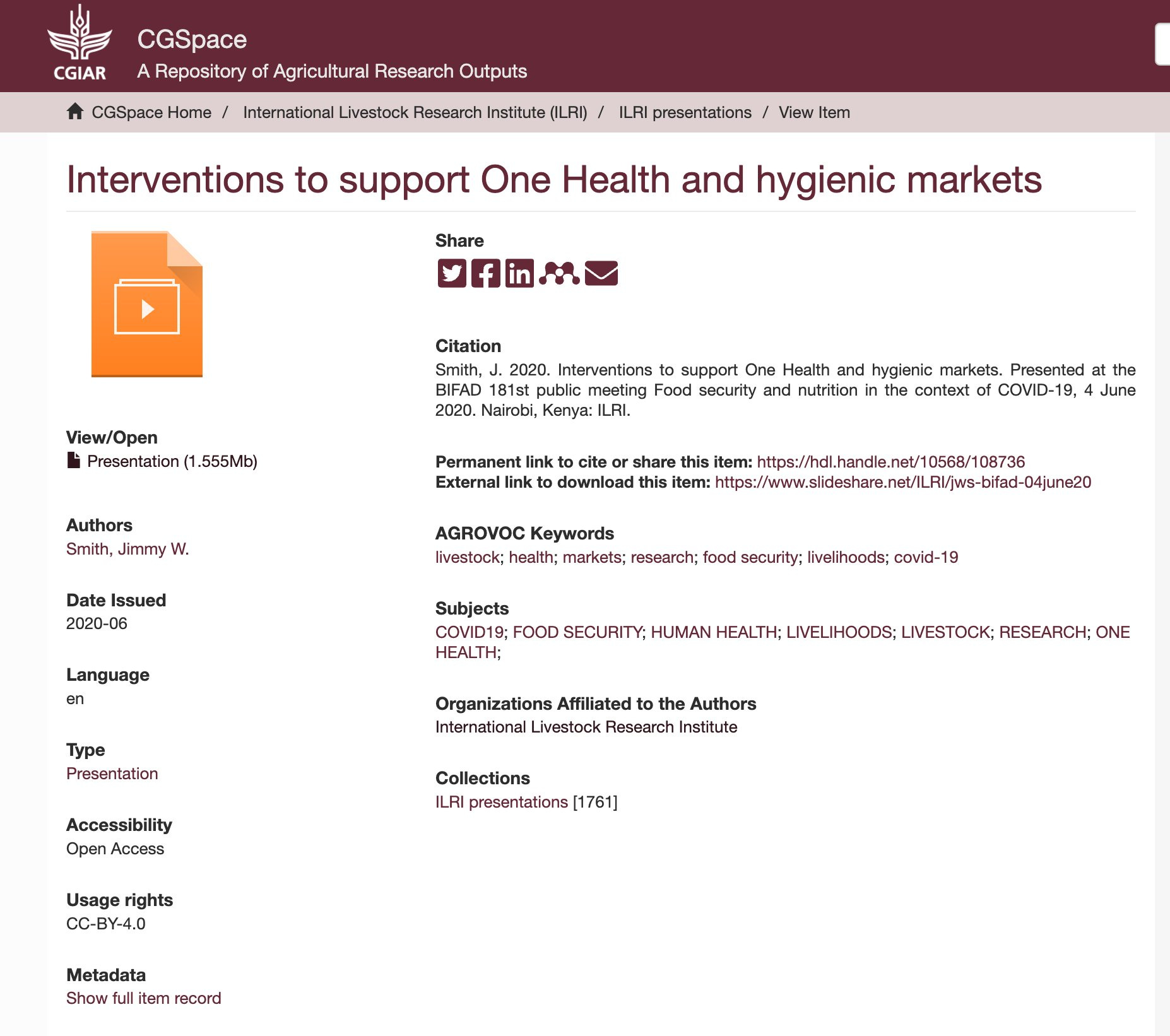
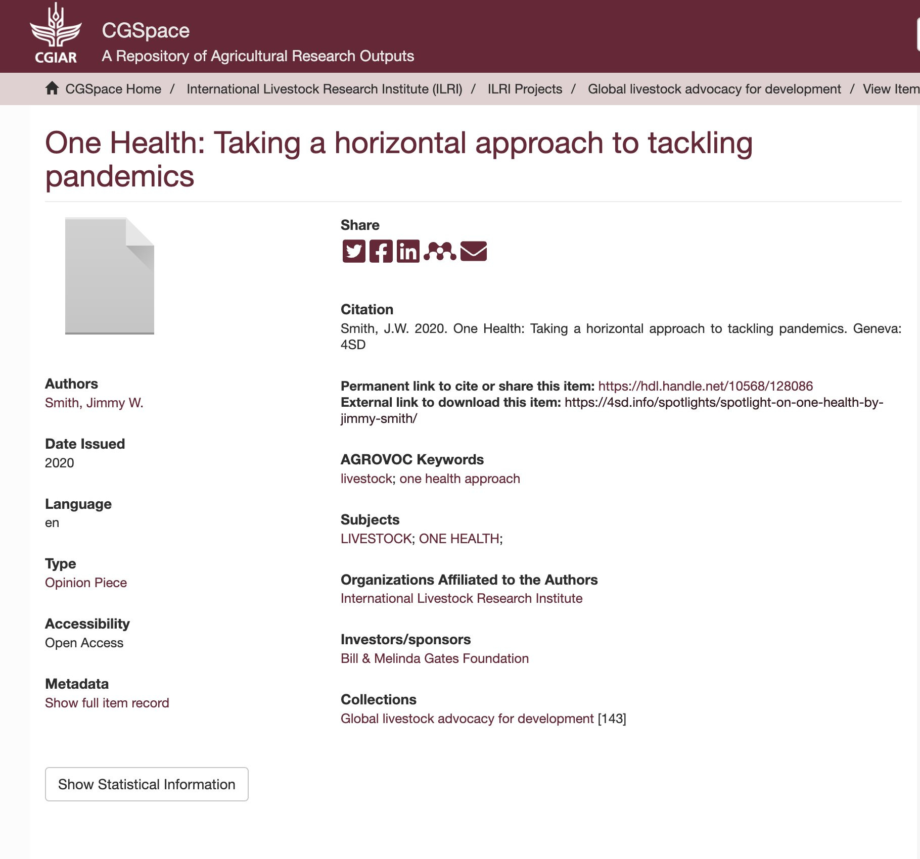
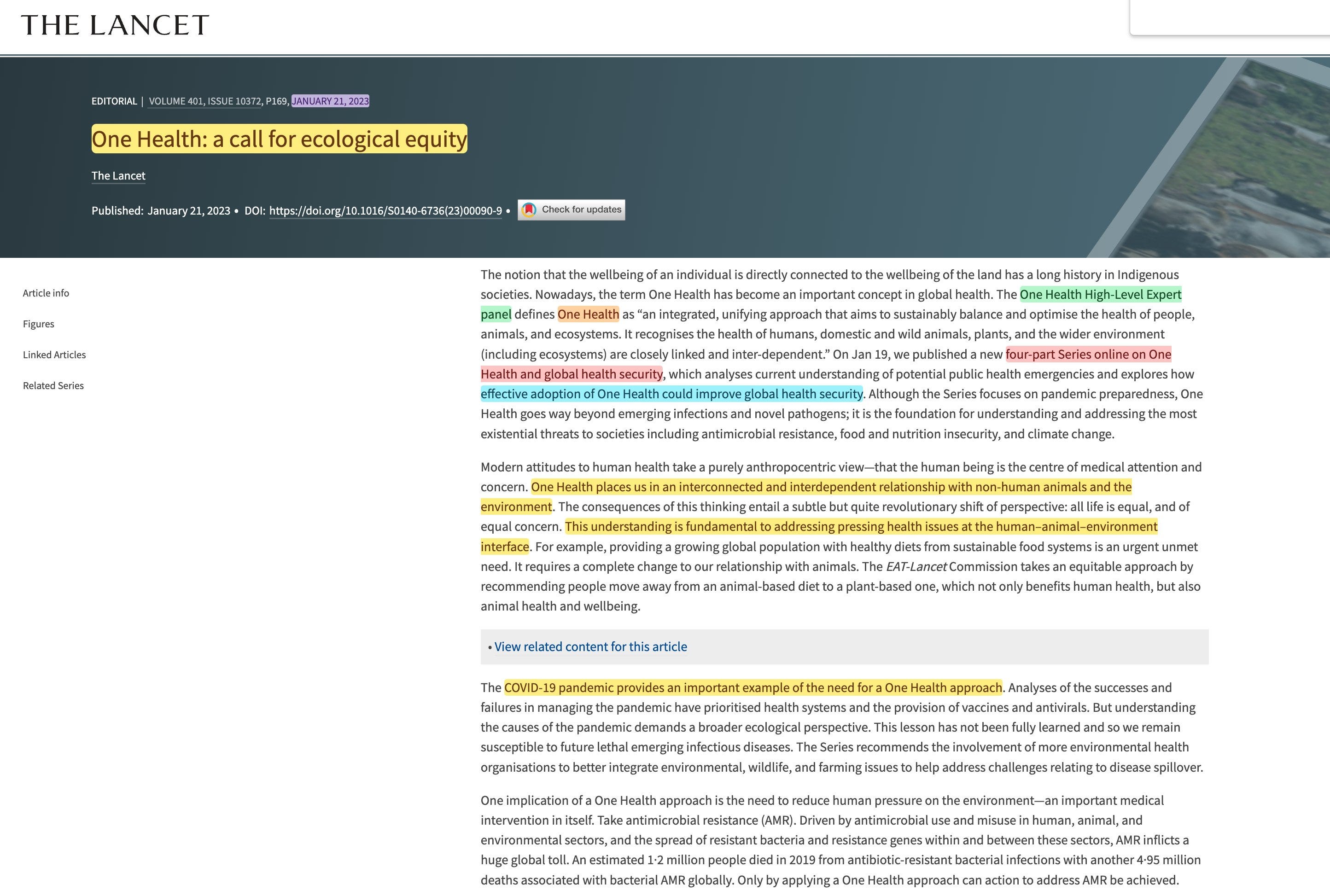
Two of the papers are penned by ‘Jimmy Smith’. Zip all the way up top to confirm that he also penned the World Bank paper. Yes, really. And the Lancet only earlier in the year joined the call - ‘One Health: a call for ecological equity‘.
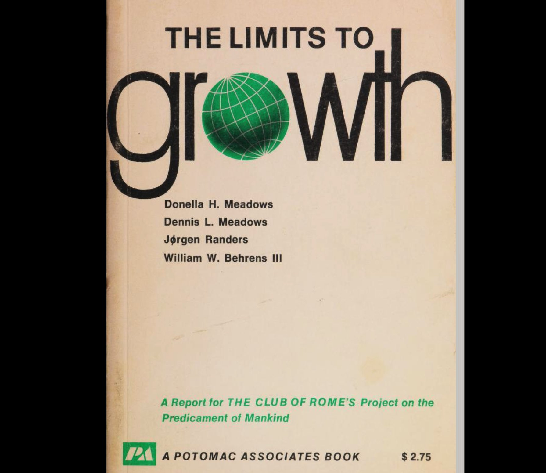
There’s really only one final link to establish here. Say hello to Dennis Meadows.
In 1972, he co-authored a rather notorious book - Limits to Growth. If you haven’t read it, you should. It’s about the carrying capacity of planet Earth, and how we’re so much beyond what it can realistically carry.
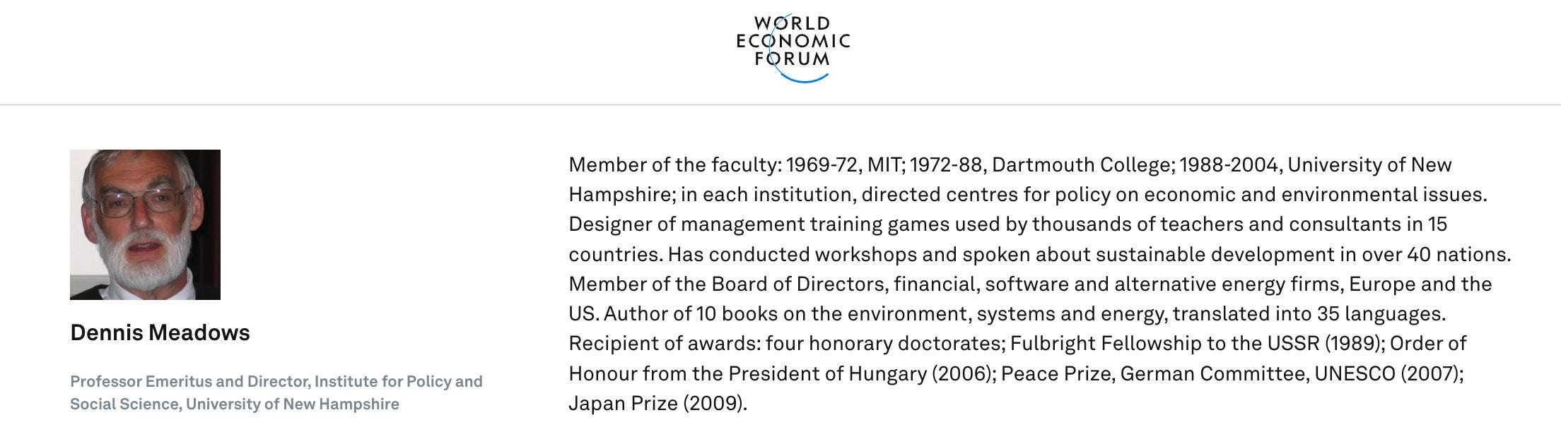
We should be at 1-2 billion, but we are at 7. That means 5-6 need to go. But don’t take my word for it, here’s an interview with the WEF member from a few years back.
He hopes it can come back down by ‘peaceful means’. There’s an even longer version here.
And it’s at this point you once again have to ask yourself the question. Is this extraordinary set of extraordinary coincidences merely extraordinary coincidences?
If you think they are, then the blue pill is for you. Alternatively, head over to Yogaesoteric’s three-part article on the matter.
Which he, ironically, wrote to protect you. Unlike Jimmy Smith.

And as for ‘4sdfoundation‘, their motivation couldn’t be any clearer.

Welcome onboard the Substack train!
A some tips from a not-entirely-successful Substacker on article management:
- Aim for 1 to 2 pages. Most people don't have long attention spans, and the longer the page, the less likely they are to finish reading it (more likely there will be errors). I will admit there was too much for me to digest in one sitting.
- Break up in-depth research into multiple articles, each one covering a sub-topic of the wider research. You can then always link back to your earlier articles in later articles, making it a convenient bookend reference.
- By breaking it up into distinct articles, you make it easier to bring up the new links in conversation so you can keep re-stimulating the discussion. It also allows you to reference specific areas rather than lumping a large haystack for someone to sift through.
- Provide links and references for everything (it seemed like only a handful had links?). Screenshots are nice, but... they can be fabricated. Or altered. The original source material can mysteriously disappear, and providing a link allows someone to reference the original source material, which may include context you might have missed or may be pertinent to someone else's research.
- If you quote or reference something, and the source material changes, be sure to re-refer to the link (even if it's a link you posted earlier).
- Shrink the size of your screenshots to 'readable size', rather than full screen; full screen screenshots force the individual to scroll more frequently when reading the article, which is an unpleasant experience, and the large images can "swamp out" the text and distract from the readability of it. If the text is unreadable when shrunk, then, by all means, keep it full, but if it can be smaller, make it smaller.
- Highlighting in yellow is nicer on the eyes (and better for people with colour blindness) and less distracting than primary colour red underlining. If you use GIMP, add a new layer, and set the layer mode to "Darken only" to get the effect.
- Put effort into your thumbnail. It is what entices people to click. A 1200w x 1000h I find is optimal-ish given Substacks weird inconsistencies in sizing. You won't always produce 'winning' thumbnails (I know I don't), but good thumbnails really drive engagement. Use pixabay.com if you need free-for-commercial use images as a template (you should seek to customise and improve them).
- Use sub-headings to break up sections/areas where possible. Not only does this help with 'trackability' when trying to read the article visually, but Substack makes it so you can provide direct links to sub-headings in your article, so it's even easier to reference specific sub-sections.
I really ought to write up an article on what I found out about Substack...
Love this info. Thank you.